The original challenge
How do you refocus an entire brand after a major business transformation?
How it was solved
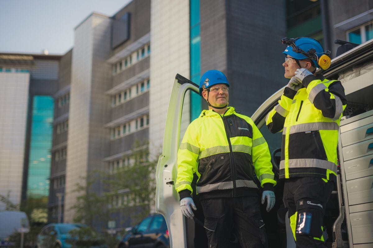
When we began working with Voimatel, they had a clear goal: to get their story right so they could inspire both their team and the outside world. In 2024, Voimatel divested its electricity network operations and turned its full focus to ensuring the availability of data networks and critical digital infrastructure. The shift had far-reaching effects across the company, from internal operations to the services it provides.
The transformation called for strategic clarity, cohesive service design, and a new brand identity. In this change, the brand played a central role in communicating the shift, building trust, and creating a positive emotional connection, both internally and externally.
Recognizing that Voimatel largely operates in Finland (currently) but serves international telecommunication clients and has presence through their subsidiary, Boftel in Estonia, we made an important pivot early in the process: we led the brand strategy work in English, while still working across both English and Finnish. Although initially uncomfortable, this bilingual approach created an environment of openness and collaboration that ultimately strengthened the work. It ensured that Voimatel’s brand foundations were globally relevant while remaining deeply authentic to their Finnish roots.
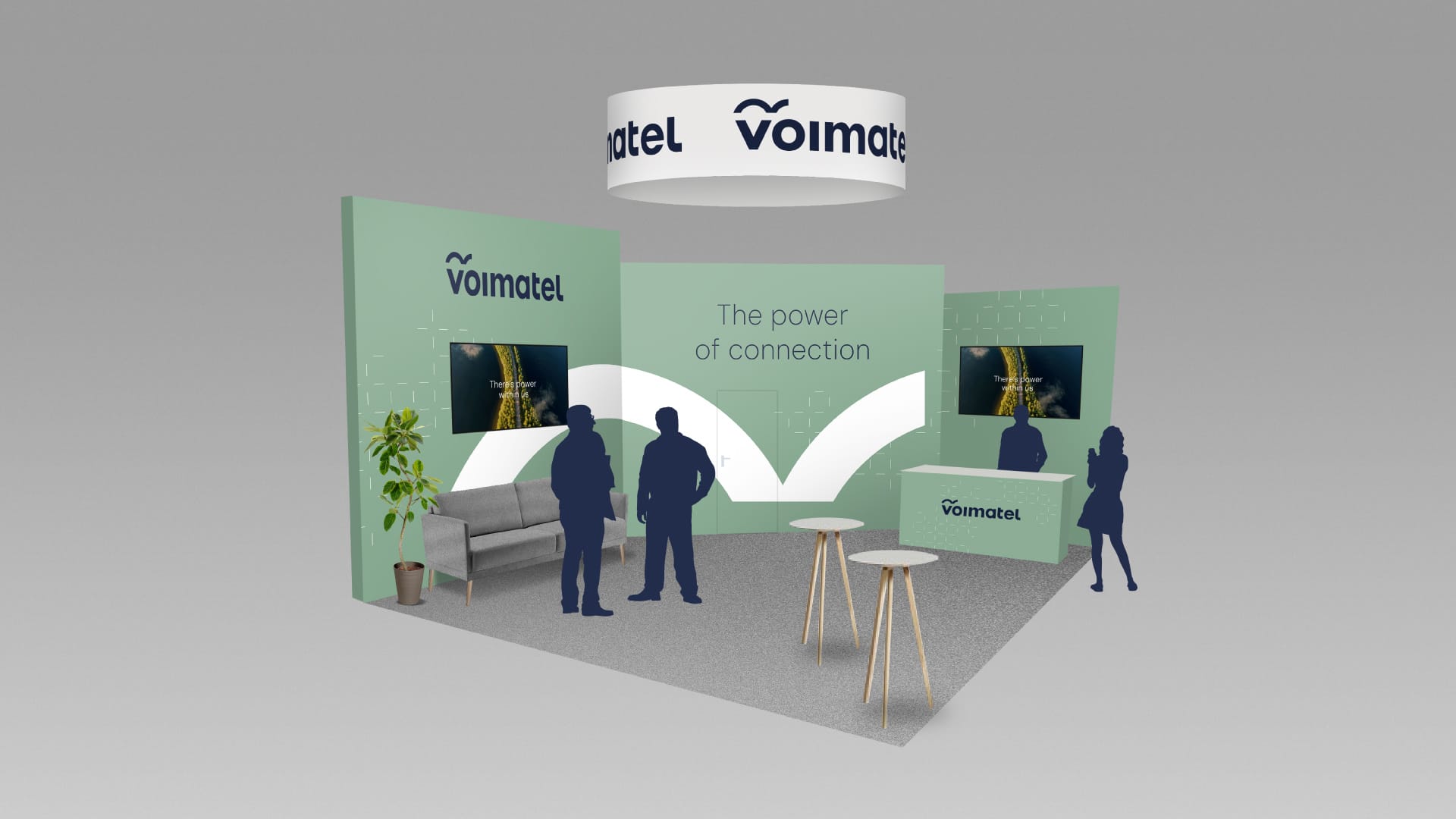


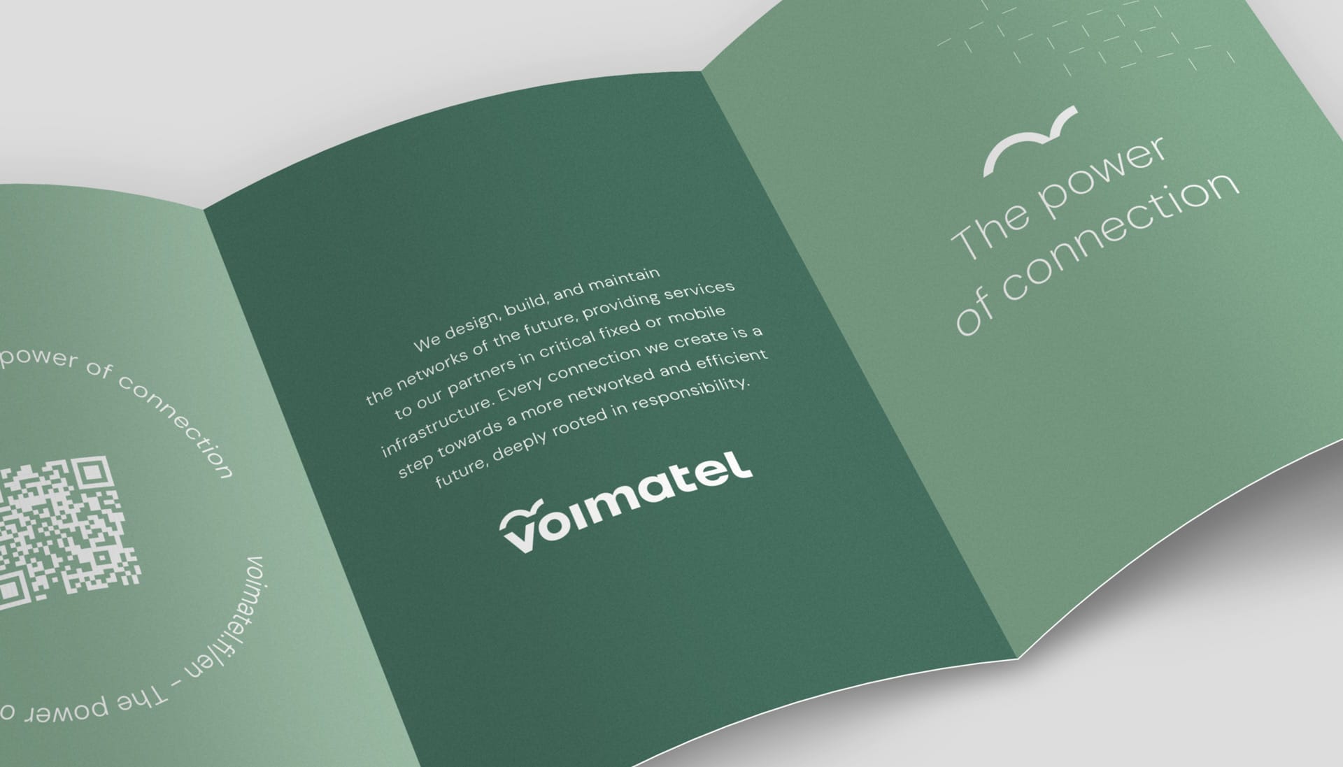
Together, we developed a brand strategy and identity, including key messages, and clarified Voimatel’s fixed network service offering. With the foundation set, we designed and built a new website that reflects the redefined business. We supported the launch phase with communications themes and social media frameworks, and we continue to collaborate on marketing to support both day-to-day needs and larger campaigns.
When the brand launched, Voimatel brought together around 65 business leaders from across Finland for a special day in Kuopio focused on their new business strategy. We had the privilege of participating in a panel discussion about the brand, sharing the story behind the process and the outcomes. It was one of the most memorable and inspiring launch days we’ve ever been a part of, carried out, fittingly, in an awkward but perfect mix of Finnish and English.
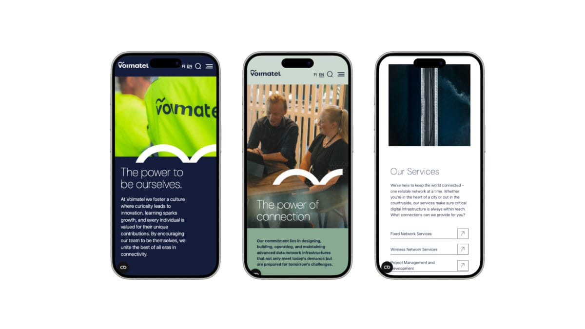
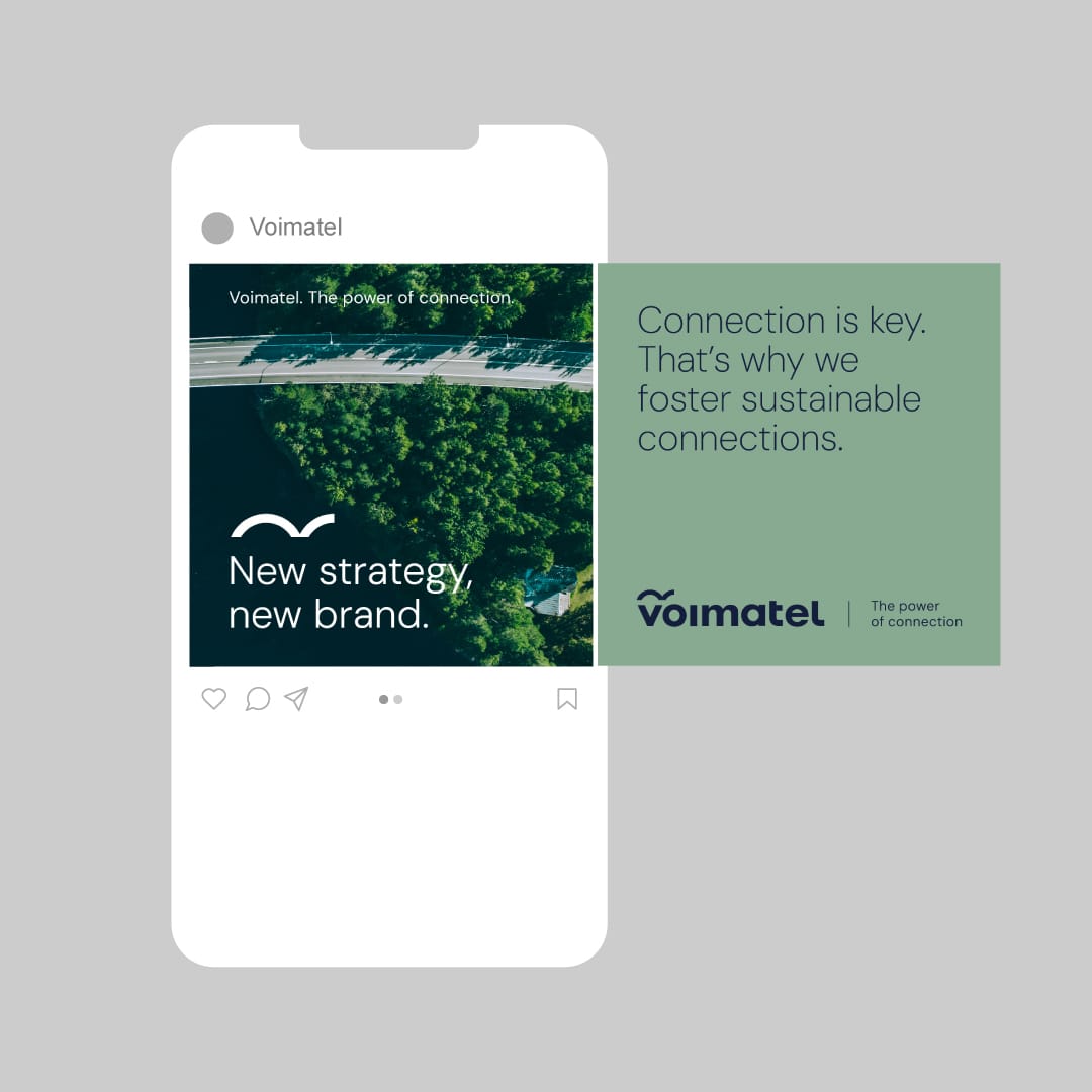
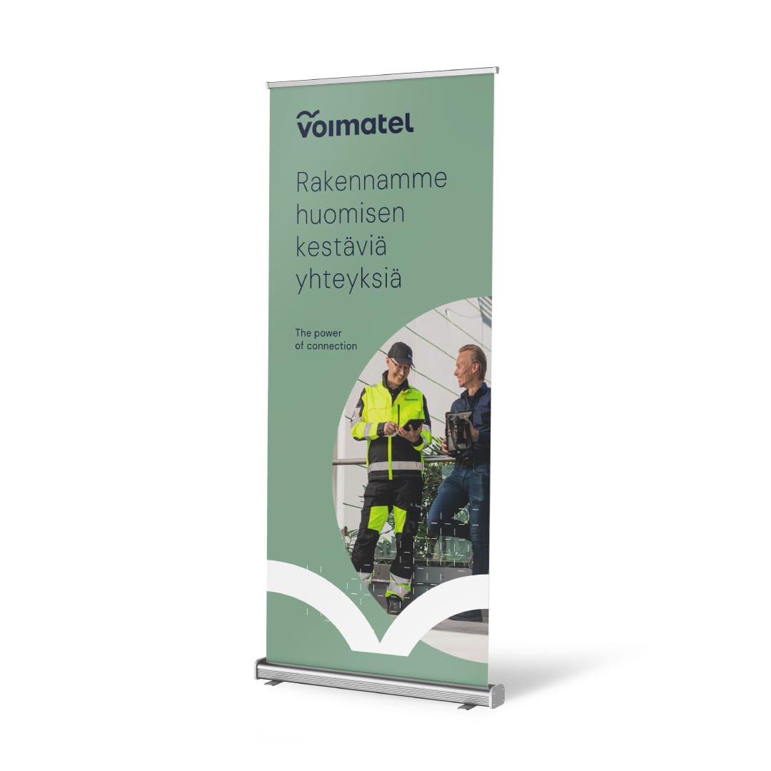
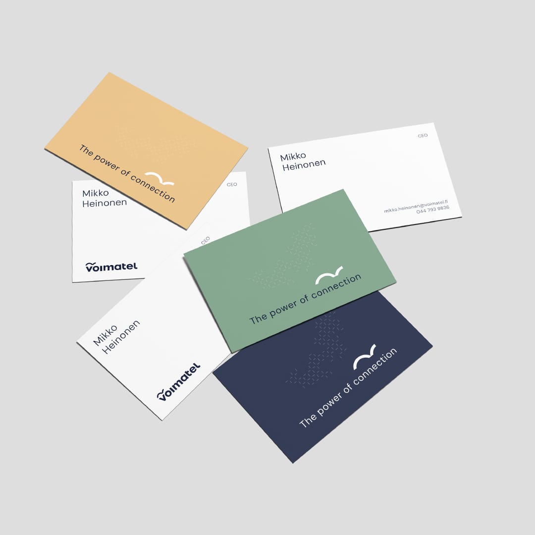
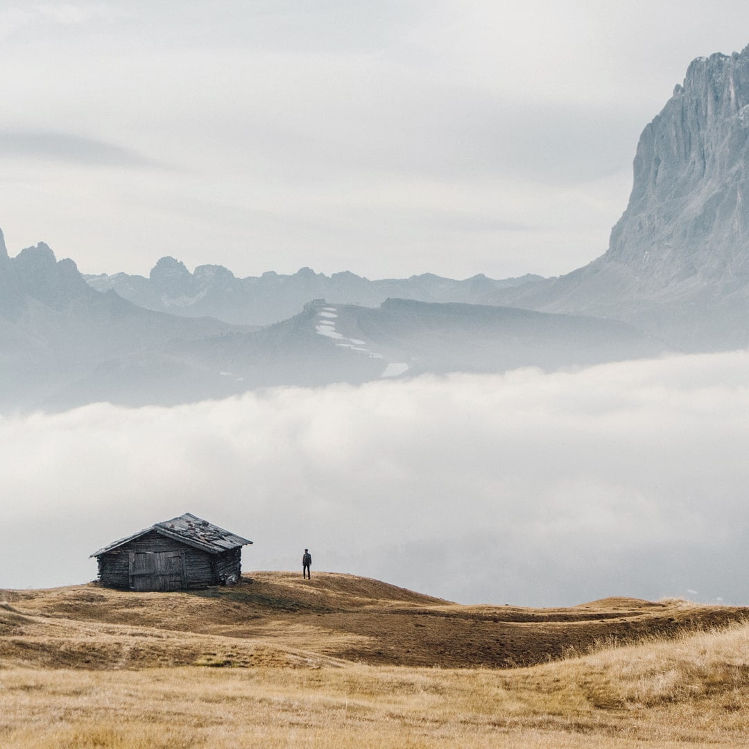
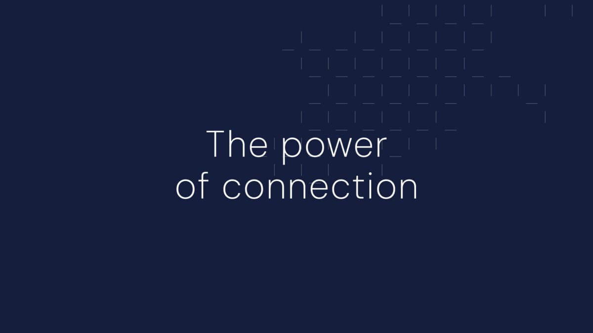
Today, most of Voimatel’s everyday communications are in Finnish but with an English brand foundation, including the unifying tagline “The Power of Connection”, Voimatel can effortlessly engage across international environments. The new brand honors their legacy while keeping them firmly future-ready, allowing them to deliver on its promise: designing, building, and maintaining resilient networks that exist, above all, to connect.
voimatel.fi/en
This text is also in finnish. Read it here.


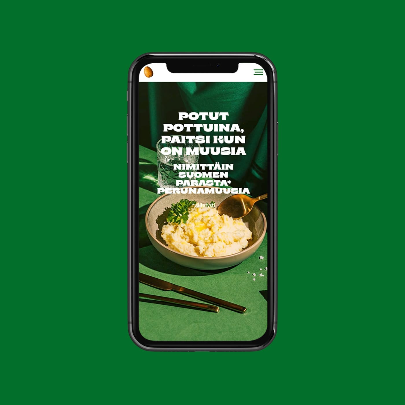
A cheeky nod to mashed potato
Kruunu Herkku prepares ready-made meals for both households and food industry professionals. They turned to us with the goal of increasing awareness and enhancing their brand image across both consumer and food service sectors.
With a 25 year history, the company stands out for its quality, ease, and reliable partnerships. But before engaging in conversations about these strengths, you first need to grab the customer’s attention—and that’s where a well-executed campaign comes in.
People are typically drawn to products before they connect with the brand itself. Just like Saarioinen is known for its liver casserole, Valio its Aura cheese, and Atria its smoked sausage, we wanted mashed potatoes to become synonymous with Kruunu Herkku. It’s one of the company’s most beloved flagship products, and highly regarded.
In our campaign, we crafted with a no-nonsense cheeky nod to mashed potatoes, celebrating and drawing attention to what is arguably Finland’s best mash. Through playful visuals and provocative statements, the campaign highlights this standout product in a way that sparks curiosity and conversation.


Many of today’s trends emerge from everyday things often considered mundane. At their best, they can even achieve a cult status. That’s why diverse channel choices and bold expressions were key to amplifying the campaign’s reach.
Thought-provoking messages, combined with a distinctive visual identity tell the story of the potato in a memorable way. The photoshoot was organized in collaboration with Huhu Digital.


“Working with Ahooy has been easy from the very beginning. They understood our needs in relation to our future goals and they helped us break free from old-fashioned thinking and embrace new ideas. It’s a fantastic campaign that we are proud of—and we wear our mashed potato shirts with pride.”
Niina Nikulainen
Sales and Marketing Director, Kruunu Herkku
The heart of the mashed potato campaign is the adaptable landing page which was designed to be repurposed for future campaigns. This makes it easy to relaunch and spotlight campaigns repeatedly, turning it into a sustainable marketing tool for Kruunu Herkku.
Are you ready to taste Finland’s best mashed potatoes?


Making the metal industry more energy-efficient
The metal industry has been recycling raw materials long before the concept of a circular economy emerged. Yet, the sector continues to seek recognition, both from the general public and policymakers. Associations with scrap and waste are typically negative, and the industry is rarely linked to environmental responsibility, carbon footprint reduction, or circular economy practices.
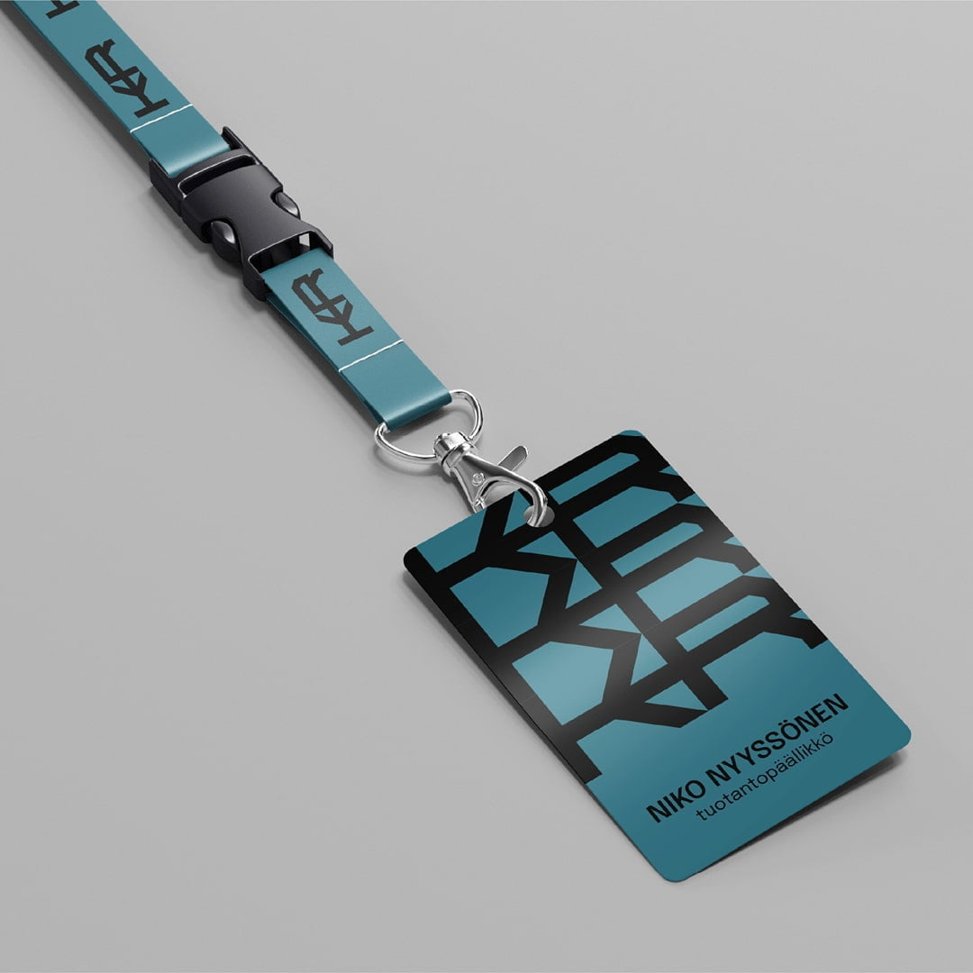
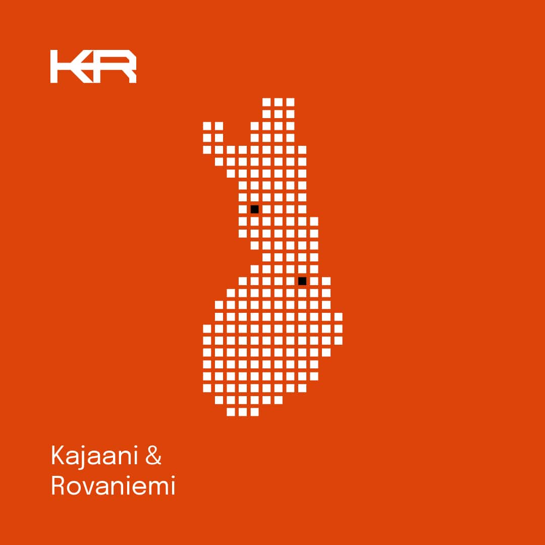
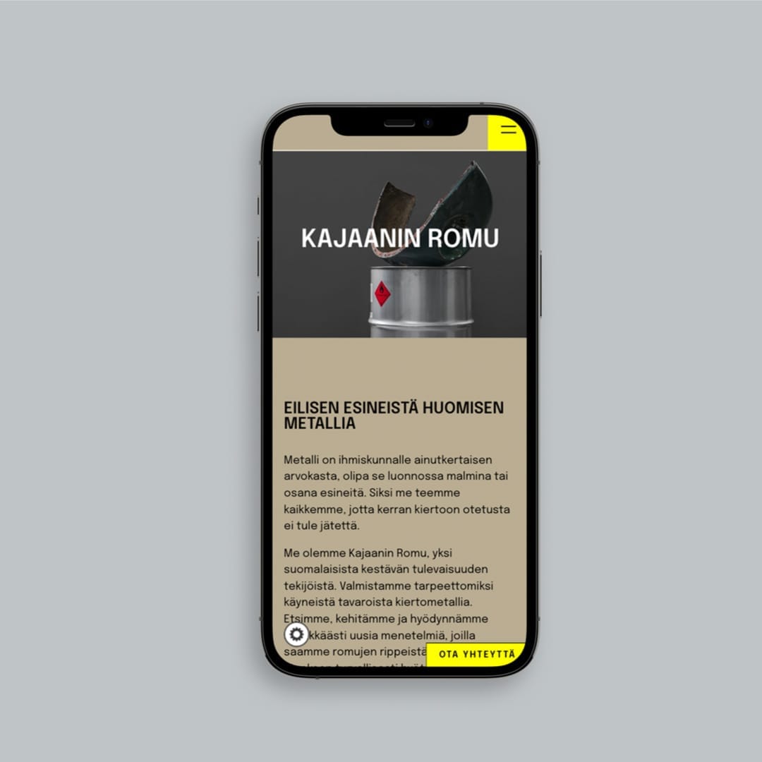
That’s why the rebranding of Kajaanin Romu two years ago set out to shift perceptions across the entire sector. The goal was to move the image away from traditional scrapyard operations and toward a modern narrative of advanced production and processing facilities.
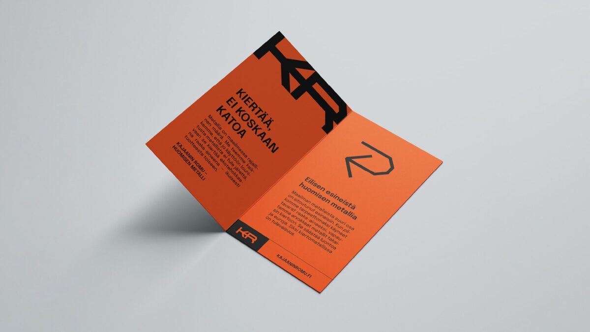
This transformation required active, illuminating, and positive communication. The new brand integrates optimism and a strong belief in progress into the company’s DNA. With concise and positive key messages, Kajaanin Romu highlights its purpose: to make the metal industry more energy-efficient and to ensure that unused raw materials in a consumption-driven society are refined and repurposed for further use.
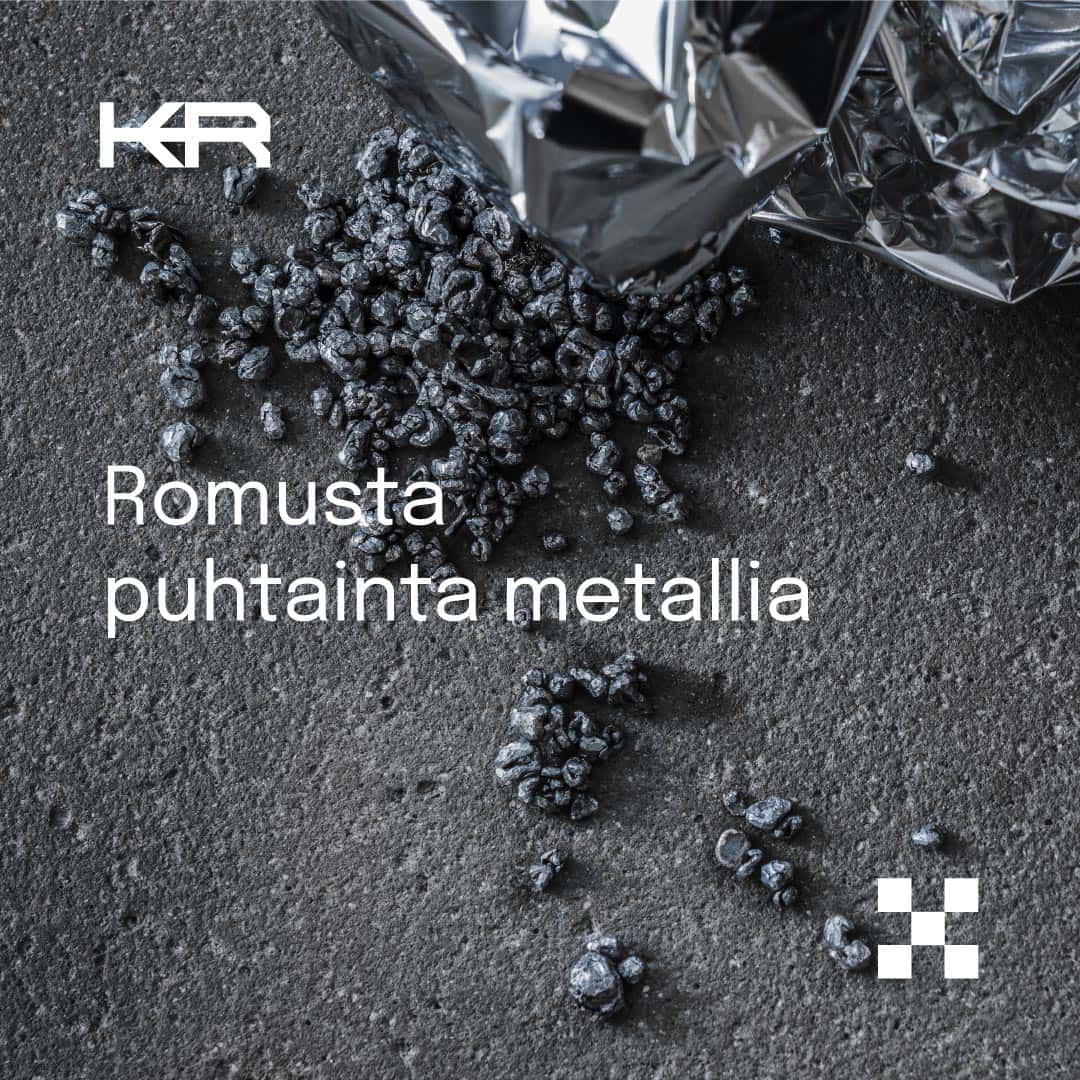
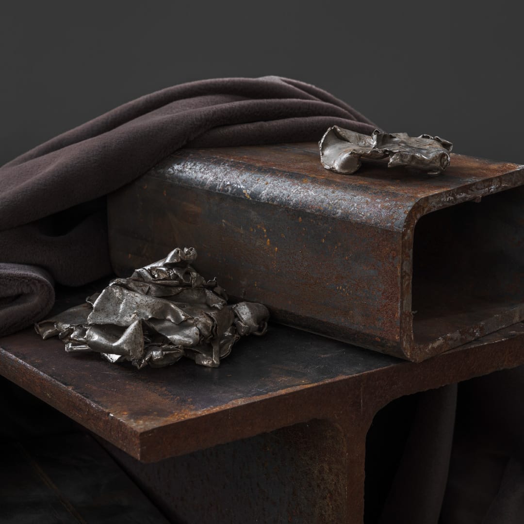
We also revitalized Kajaanin Romu’s visual identity, exploring the contrasts inherent in the concept of scrap. Scrap is often perceived as worthless waste, yet metal scrap, in particular, represents a valuable raw material. This idea is woven into the visual language, where the rough and raw are presented with beauty and elegance through carefully composed photographs.
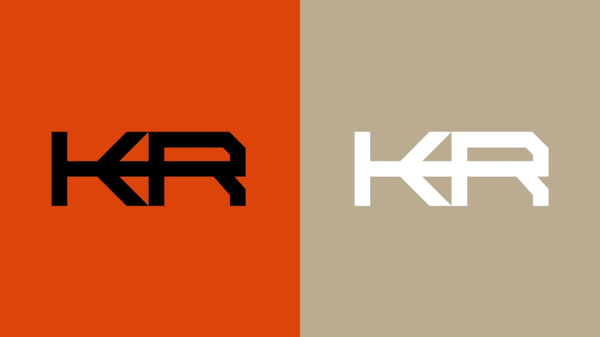
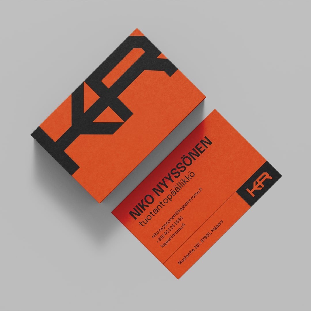
The visual identity leans on Nordic simplicity and bold color blocks and the company’s previous KR monogram logo was modernised, symbolizing seamless processes and solid craftsmanship.
Photography by: Petra Kuha
“Collaborating with Ahooy has helped me view our business and operations from new perspectives. I now have a deeper understanding of the company’s societal role. Together, we’ve achieved our shared goals and advanced the image of the entire industry. We’ve also increased community awareness about the importance of minimizing unnecessary use of natural resources and the critical role metal recycling plays in reducing carbon emissions.”
– Niko Nyyssönen
COO, Kajaanin Romu


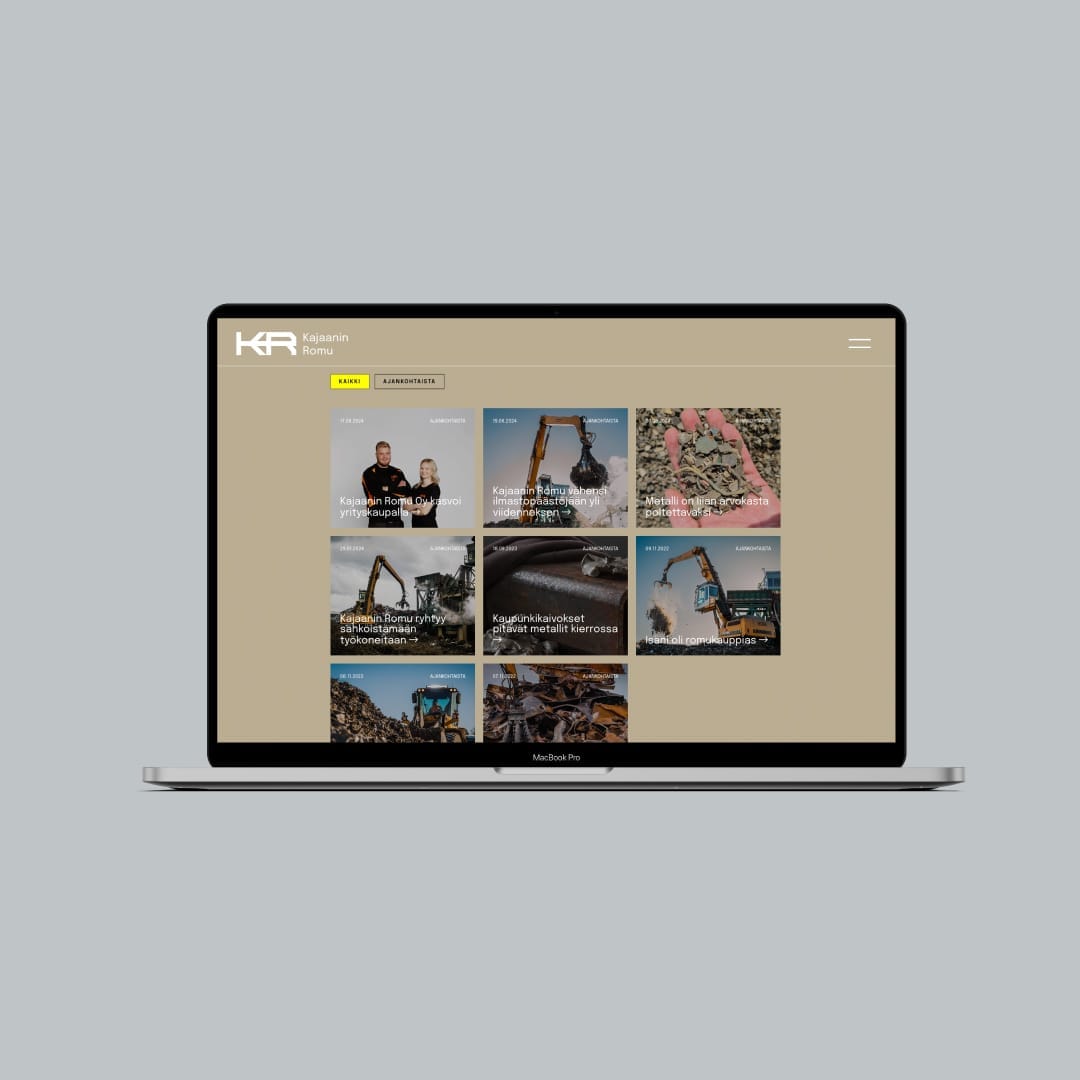
The rebrand came to life brilliantly with a new website, enhancing Kajaanin Romu’s visibility and serving as both the company’s home base and a powerful reinforcement of its brand image. A high-quality website is a great investment in business growth.


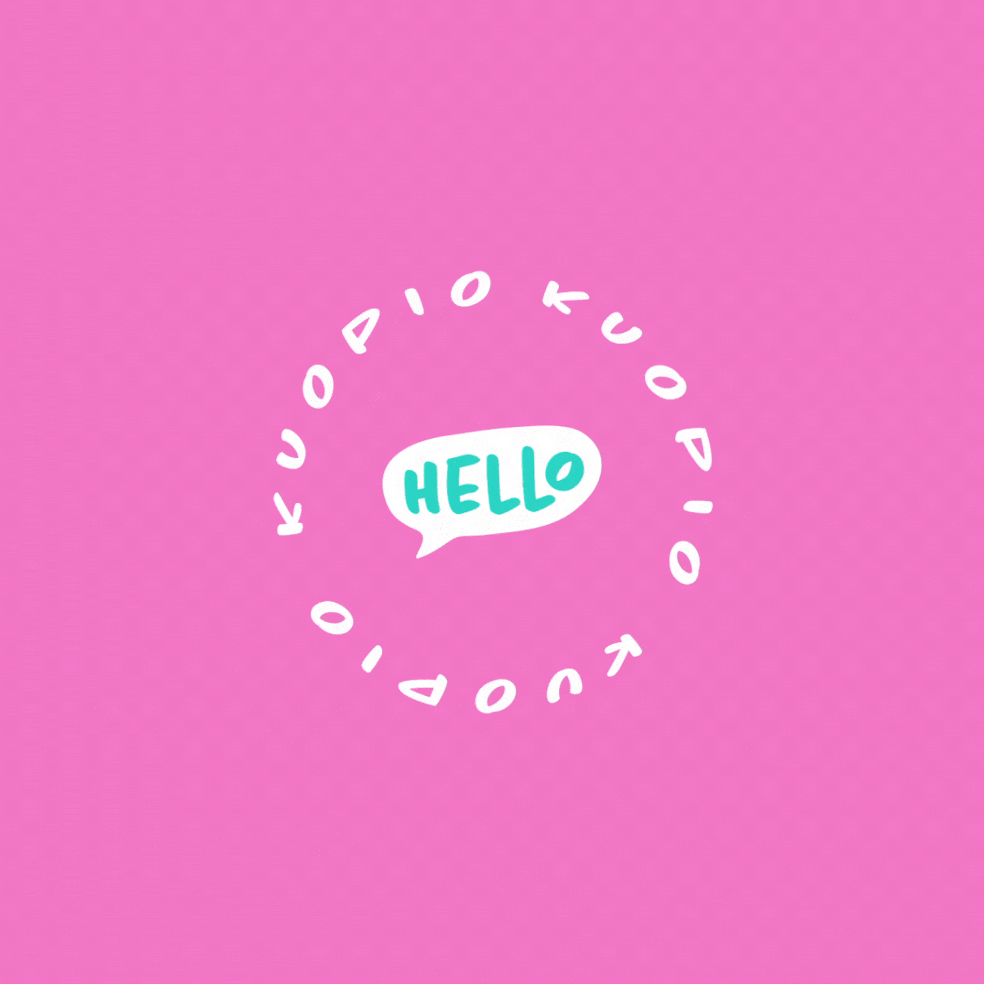
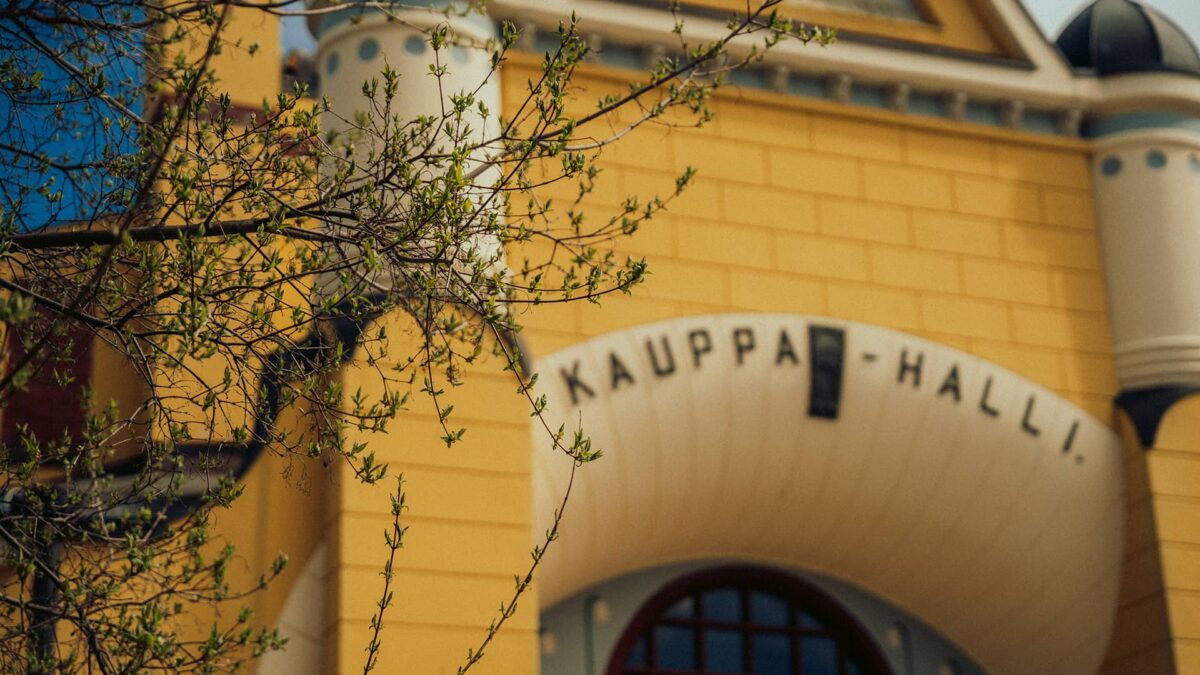
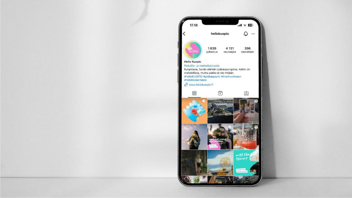
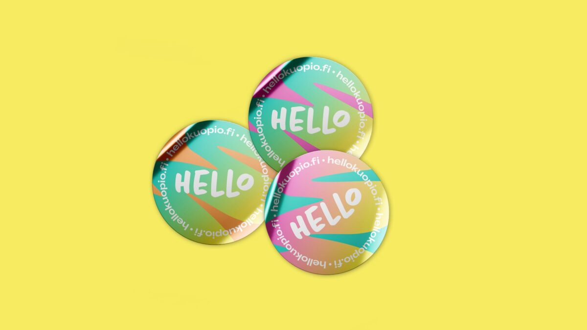
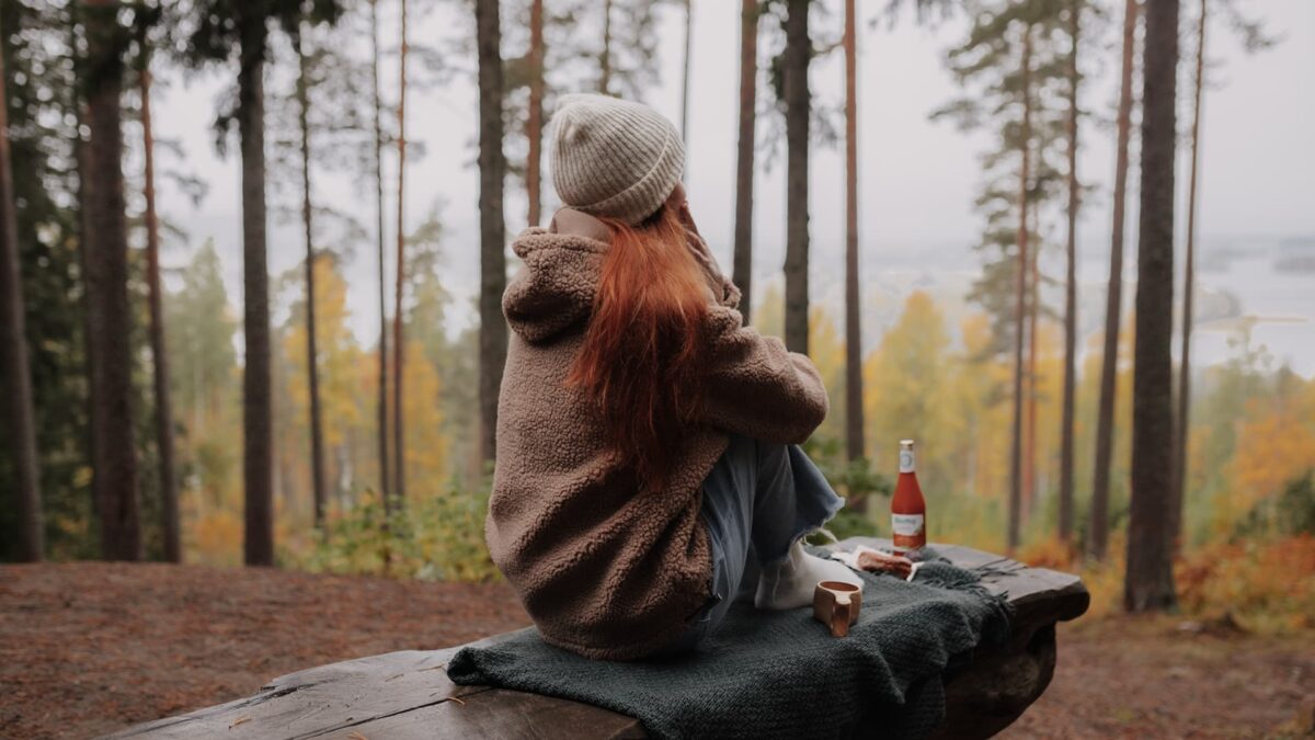
Kuopio renews its hospitality and tourism brand
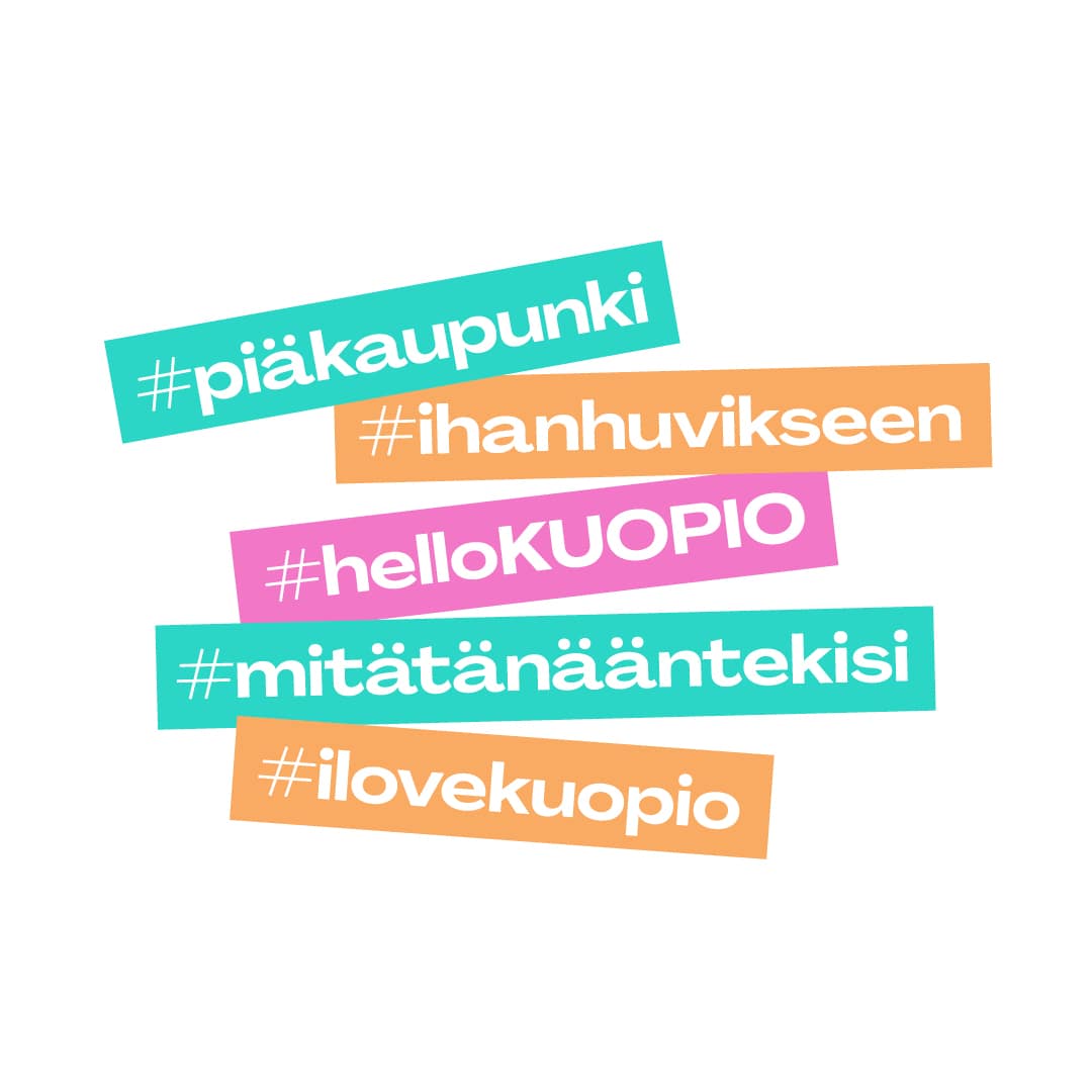
The world of tourism is evolving fast, and one of the leading global trends is the integration of tourism brands with the core identity of cities. Kuopio is following suit in its renewed strategy – after all, there’s only one Kuopio, and we want to present it to the world in a vibrant, recognizable, and inviting way. Previously known as Kuopio-Tahko, the city’s tourism brand now carries the name Hello Kuopio, signalling a seamless connection to the city’s overall identity and strengthening the link between tourism and local life.
Hello Kuopio aims to spark even greater interest in the Kuopio area while supporting local businesses with a fresh and dynamic approach. Kuopio’s unique experiences are being presented more personally and accessibly, across more channels than ever before, ensuring that both locals and travellers, from near and far, can discover the city’s best attractions and hidden gems. We want visitors to not just explore Kuopio, but to feel like they belong here.
Rooted in Kuopio’s core values of good life, joy, and well-being, Hello Kuopio focuses on the joy of discovery and connection. Whether you’re savouring local flavours, exploring the beautiful surroundings, or engaging with our rich cultural heritage, Kuopio is a place where joy shines through every experience.
With Hello Kuopio, we extend a warm invitation to the world – come experience the city’s vibrant pulse, uncover its hidden treasures, and embrace the joy that lives in our people, our traditions, and our way of life.

A distinctive and inspiring Kuopio
“Digitalization is rapidly transforming the tourism industry, and customers are increasingly searching for and purchasing services online. It is critically important for Kuopio to present itself online in a unique and inspiring way. We have a long-standing relationship with Ahooy Creative, working together on the development of Kuopio’s brand and recognition. Hello Kuopio is a fantastic addition to this continuum, further unifying our brand strategy. Thanks to our long-term collaboration, Ahooy’s diverse expertise, and their creative ideas, we are able to showcase Kuopio’s experiences in a truly impressive way.”
– Kirsi Soininen, Marketing Director, City of Kuopio
Boldly inviting, and proud to show it!
Tahko is a mountain and Kuopio is the capital good life. This isn’t boasting, just a joyful fact that anyone can experience by visiting Kuopio.
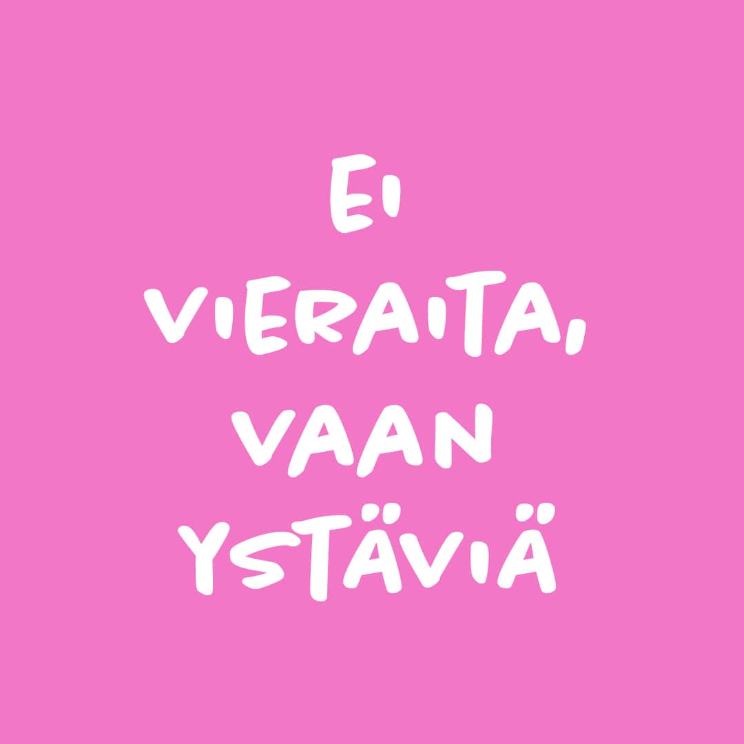
And while life in Kuopio may seem ordinary on the surface, it’s truly something special. As a city, Kuopio is colourful, quirky, warm, and laid-back. It’s a place where people are free to live life on their own terms. There’s no need to fit into a mould, always have everything figured out, or be perfect. This is exactly how we envisioned Hello Kuopio.
In the transformation of the city’s tourism brand, we didn’t just rethink strategic guidelines—we reinvented the name, appearance, and marketing approach. The new visual identity is alive with energy and playfulness, expressed through a joyful and unique movement language. The imagery and videos will evolve with the seasons, with a focus on showcasing the authentic, beautiful, and diverse Kuopio. Hello Kuopio’s marketing is designed to be multi-channel, leaving room for spontaneity and fun instead of getting stuck in rigid formats. Genuine human connections, friendly competitions, quizzes, and cheerful interactions are the true essence of Kuopio, and they’re now woven into the city’s tourism brand.
With this new brand, we hope Kuopio will show all its friends, near and far, just how easy it is to experience great joy here—joy that lives in every experience and shines through the smiles on people’s faces. In Kuopio, we live, we laugh, and we celebrate—just for the fun of it.

So no good job is left undone
Osuma Personnel Services was born from the vision that it’s time for the working world to evolve. The company recognized that old methods no longer serve businesses or professionals effectively.
There was a need for a new era of personnel services, one that develops, trains, and accelerates work communities characterized by a strong drive to succeed. For companies and leaders, Osuma promises to turn human capital into a sustainable success factor, match the right talent with the right job, and unlock the potential within individuals. Osuma appeals particularly to professionals seeking both individual recognition and respect in their careers and stability in their professional and daily lives.
Osuma is a pioneer in personnel services in Finland and has been growing continuously since its founding in 2016. Today, it is the largest operator in its field in Eastern Finland. As a strategic partner in the management and development of human capital, the company offers extensive expert services in personnel acquisition and development, recruitment and work-life training, direct recruitment, and various assessment services. Osuma employs approximately 750 professionals monthly.

The working world needed to evolve – and so did Osuma
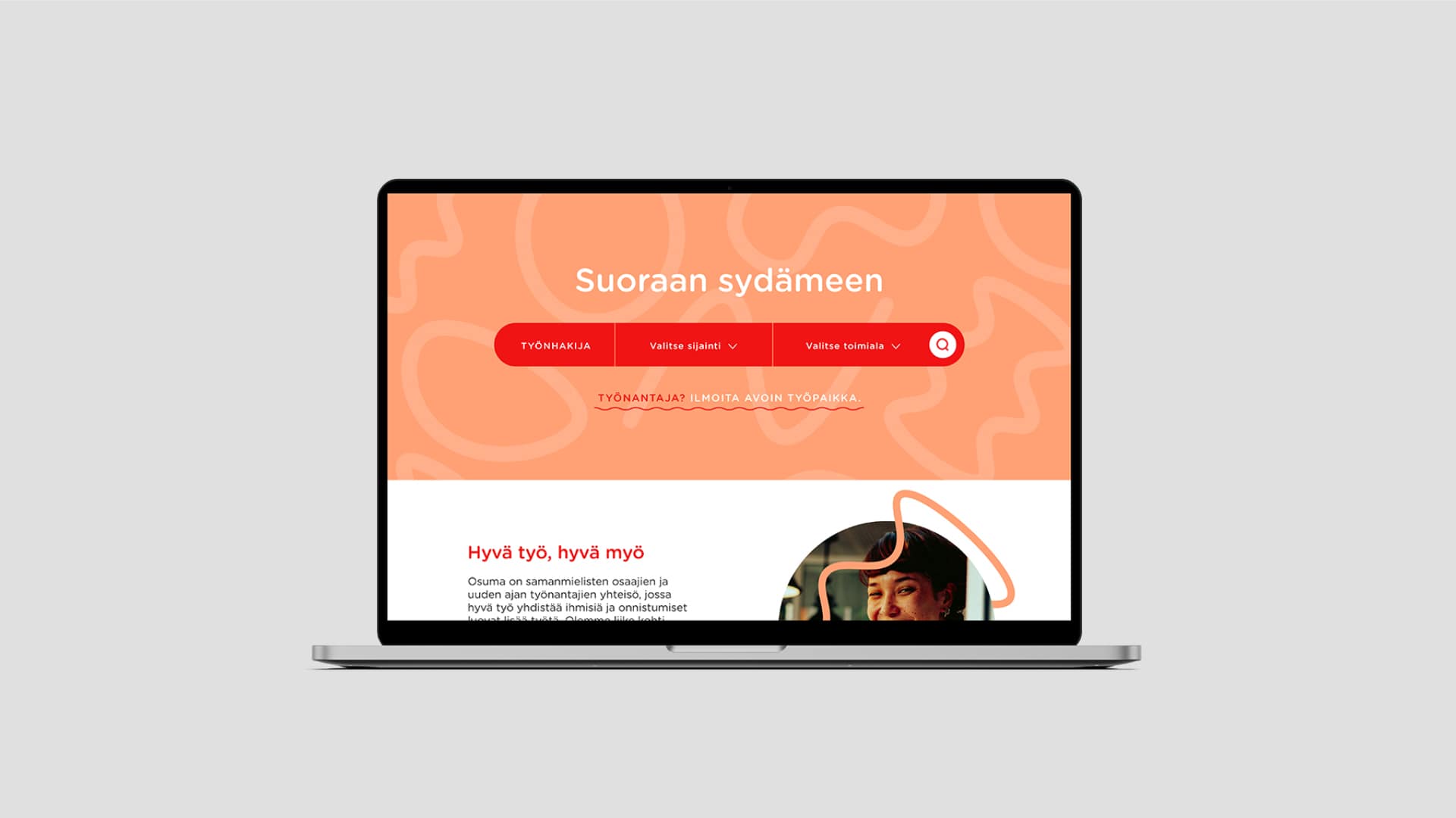
We continued the work and the journey we started with Osuma Personnel Services in 2016. New times and bigger goals meant that the company decided to write a brand strategy and new core messages. We also renewed the online services and digital marketing.
Osuma’s strongest message was selected as the compelling and emotionally engaging slogan “Straight to the Heart.”
In addition to emotion, the brand needed to be brought to life. Osuma is a highly versatile company, and since most of its visibility occurs on digital platforms, it was justified to create a recognizable visual language for the brand. Now Osuma always stands out in a high-quality manner, without the need to reinvent the wheel for every video production. The company has a ready-made template and a large animation library at its disposal.
It was also time to renew Osuma’s online presence. The website was revamped with user experience and accessibility in mind. The pages needed to serve both job seekers and employers better. At the same time, digital marketing was updated. While search engine advertising can nowadays be considered part of a company’s basic accessibility, it builds a significant competitive advantage when done correctly. We decided to delve deeper into analytics and conversion data and revamped the continuous advertising model.
Results at Osuma were immediate. The number of applicants through the website started to grow immediately, and the conversion rate increased by over 16%. Along with growth, quality also improved significantly. When measuring how much it has cost in digital marketing to achieve a successful conversion, i.e., an application submitted from the site, the price has decreased by 27%.
This work came from the heart and hit straight to the heart.


“Good marketing is always both strategic and operational. It involves short-term and long-term play. We want our marketing partner to know us and be able to serve across the entire scope of marketing responsibilities. That’s why close collaboration is essential. I appreciate Ahooy Creative’s style and their willingness and ability to listen. The planning and launch of the brand renewal have gone smoothly, and we have started seeing results immediately.”
– Ville Auvinen, Osuma Henkilöstöpalvelu Oy, CEO.

The Challenge
Tiny Hunter, a strategic branding agency based in Sydney, Australia, who are obsessed with the power of brand embarked on a significant transformation journey in 2023. Shifting from an industry-focused positioning to one that champions the power of branding across various industries was a monumental change. This evolution required a redefined brand identity that truly reflected the team’s capabilities, passion, and essence. Tiny Hunter created a well thought through brand strategy and visual identity that encapsulated their new positioning and brought us in to help them incorporate motion as a vital component to bring the strategy and the visuals to life. This work was extra meaningful to us as it was an opportunity to collaborate with an extremely talented group of brand professionals all the way across the world. The first of many, we’re sure.
The work
Understanding the essence of Tiny Hunter’s origin story was crucial. At its core, this story represents transformation, a theme that needed to be woven into every element of the brand’s motion identity. We meticulously created visuals that aligned with these themes, ensuring that each motion element was purposeful and resonated with the brand’s new identity. The use of vibrant colours, fluid animations, and seamless transitions all contributed to a cohesive and compelling motion identity. We aimed to ensure that every movement within the brand narrative told a story of transformation, encapsulated by three key words: Rise, Rhythm, and Transformation.
Rise: The concept of rising was integrated to symbolise growth and the upward trajectory of Tiny Hunter’s journey. The motion was designed to reflect this upward movement, illustrating the agency’s continuous evolution and ascent in the branding industry.
Rhythm: Rhythm was employed to convey the dynamic and harmonious nature of Tiny Hunter’s work. Smooth easings and consistent timing in the motion represented the agency’s cohesive and rhythmic approach to branding.
Transformation: Transformation, the core of Tiny Hunter’s brand story, was the most crucial element. The motion was crafted to depict metamorphosis, showing how Tiny Hunter transforms brands through its innovative strategies and creative prowess.
The result
The result was a stunning motion identity that truly captured Tiny Hunter’s brand transformation journey. The visuals brought the brand’s new positioning to life, effectively communicating the agency’s evolution and its focus on the power of branding across industries.
The motion not only enhanced Tiny Hunter’s visual appeal but also reinforced its core message of transformation. The rise, rhythm, and transformation themes resonated deeply with the audience, creating a memorable and impactful brand experience. Tiny Hunter’s new motion identity successfully showcased their capabilities, passion, and the essence of their journey, positioning them as a dynamic and transformative force in the branding industry.
“Interestingly, though, what we have found is that since our website launched with the new look and new content that our marketing spend, the conversion has improved by over 70%, which is a lot.”
– Jodie deVries
The challenge
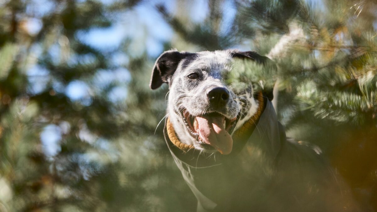
Hurtta, a beloved brand of dog clothing and accessories with a strong presence in Europe, North America, and Asia, embarked on a significant journey towards a circular economy. They were determined to share their intentions and candidly present both their successes and challenges along the way. To achieve this, Hurtta needed a compelling communications piece that would not only introduce their sustainability efforts but also elevate the brand’s value.
The video had to be crafted in English to cater to Hurtta’s global audience, targeting two main groups: their distributors and end users. The challenge was to create a piece that resonated well with both audiences, effectively communicating the brand’s sustainability goals and initiatives
The Work
Ahooy Creative collaborated closely with Hurtta to understand their vision and goals. Here’s how we approached the project:
Understanding the vision
We started by immersing ourselves in Hurtta’s journey towards sustainability, understanding their commitment to a circular economy, and the specific goals they aimed to achieve. This involved in-depth discussions with the Hurtta team to capture the essence of their mission.
Crafting the message
Our next step was to develop a clear and compelling narrative that would communicate Hurtta’s sustainability efforts. We focused on creating a storyline that highlighted both the wins and the challenges, ensuring authenticity and transparency.
Producing the video
With the narrative in place, we moved on to the production phase. Our team worked diligently to create a visually engaging and informative video. We emphasized high-quality visuals, strong storytelling, and a tone that resonated with both distributors and end users.
Appealing to global audiences
Considering Hurtta’s international presence, we ensured the video was produced in English, making it accessible to their global audience. We tailored the content to appeal to both distributors, who are key business partners, and end users, who are passionate about their pets and the brand.
The Results
The sustainability video we created for Hurtta was a resounding success. It effectively communicated the brand’s commitment to a circular economy and resonated deeply with both target audiences. The video showcased Hurtta’s dedication to sustainable practices, enhancing the brand’s value and reputation.
Key outcomes:
- Positive reception: The video received positive feedback from both distributors and end users. It successfully conveyed Hurtta’s sustainability journey, fostering a deeper connection with the audience.
- Enhanced brand value: By transparently sharing their efforts and achievements, Hurtta strengthened their brand image and reaffirmed their commitment to responsible manufacturing.
- Featured content: The video is now proudly featured on Hurtta’s web store, serving as a testament to their ongoing sustainability efforts and their partnership with Ahooy Creative.
Here’s to ten years of getting the job done right
Leica Geosystems, part of Hexagon, asked us to put on our work boots and hard hats to commemorate the 10th anniversary of Leica iCON (“intelligent construction”), their revolutionary line of surveying equipment, hardware, and software that helps construction professionals bridge the digital divide. With their years of technological advancements, it was easy to find inspiration and develop a creative concept that highlighted Leica iCON and its groundbreaking solutions that deliver true performance and profitability for construction companies around the world.
In recognising that Leica iCON’s significance lives in the field, we created a design style that complemented the company’s existing brand identity while also capturing the construction site environment where Leica iCON shines. Our work incorporated bold visual elements, a journey through Leica iCON’s decade of accomplishments, and a spotlight on the construction professionals – the heartbeat of the industry – who entrust Leica iCON to elevate accuracy, flexibility, and productivity in their work.
Our deliverables also included an anthemic video, motion graphics animations, impactful social media posts, and creative messaging that effectively communicated the benefits of Leica iCON and the enduring connection between the company and its customers. This holistic approach showed construction pros just how far the industry has come, and it heightened awareness of the Leica iCON brand, solidifying its position as a leader in the building and heavy construction sectors.
Video: Nobrainer Films
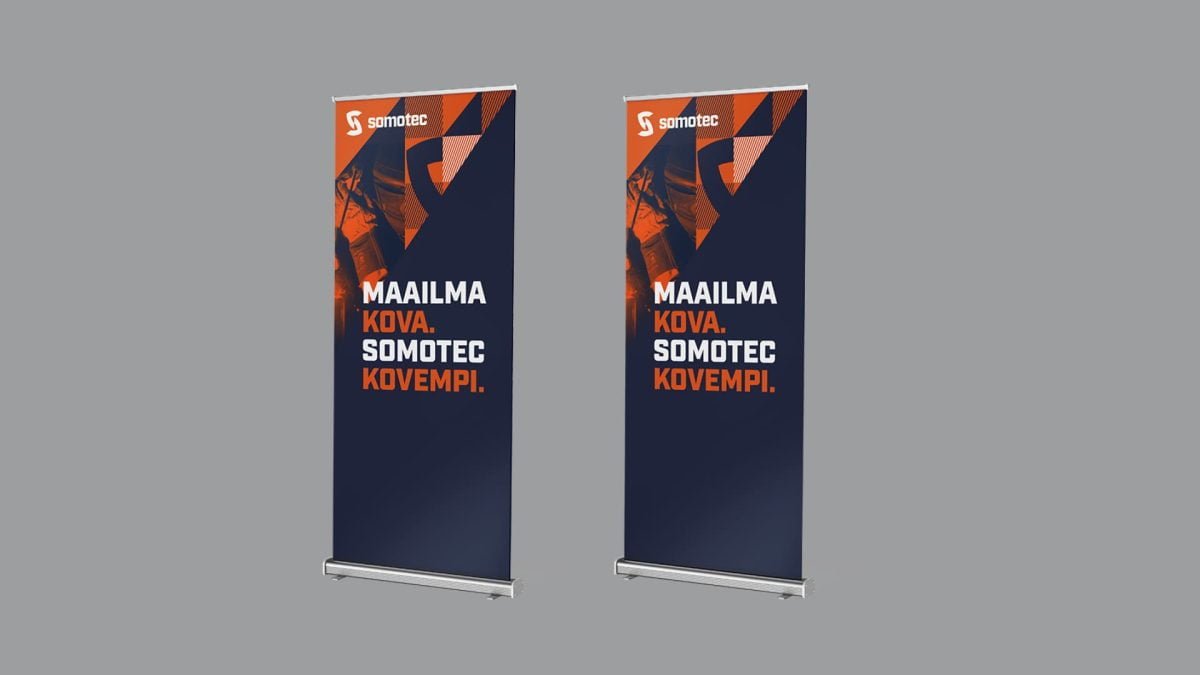
Tough stuff
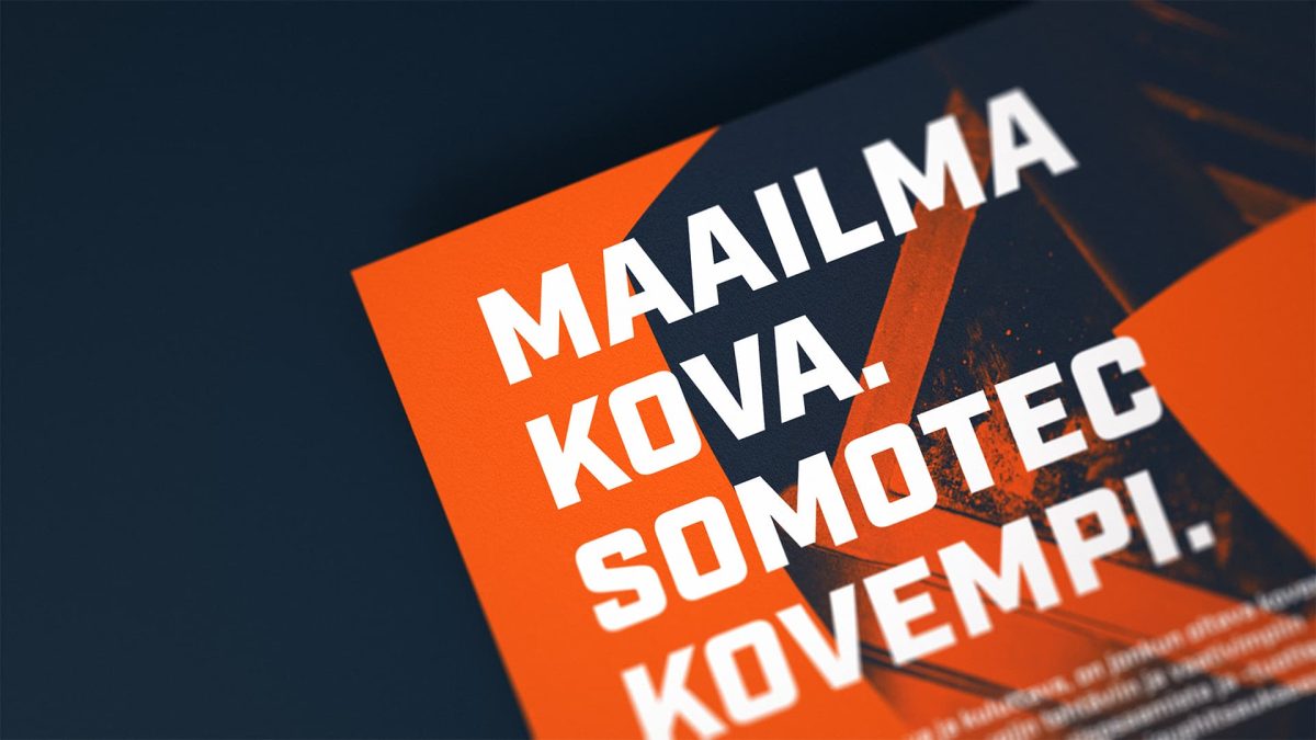
Somotec has spent over three decades building a reputation for its tough, high-quality welding additives, solders, armoured steel products, and stainless steel covering solutions. But Somotec’s brand identity had somewhat weakened over the years. Customers were seeing the company as old-fashioned and not keeping up with the times, which resulted in a decline in awareness of Somotec’s offerings.
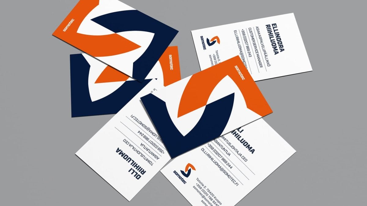
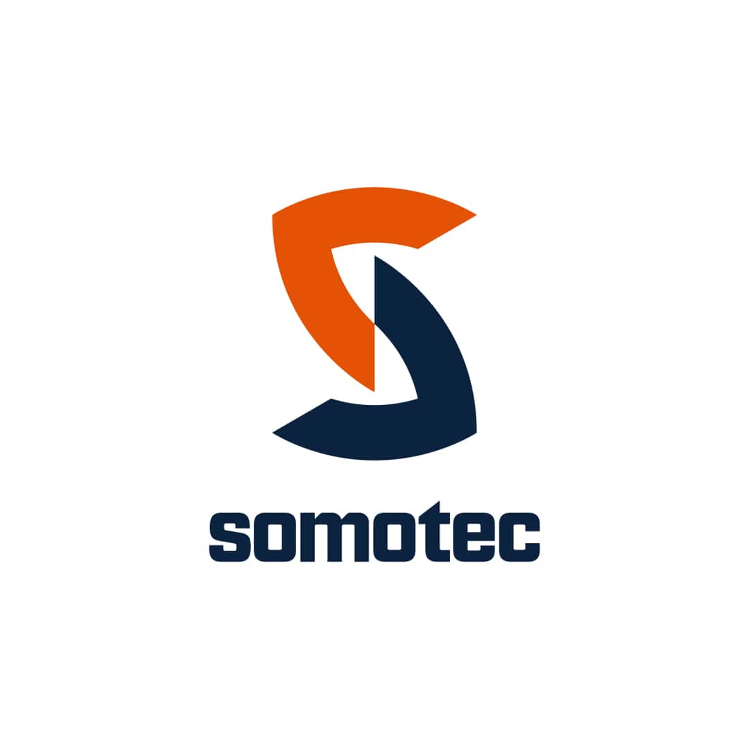
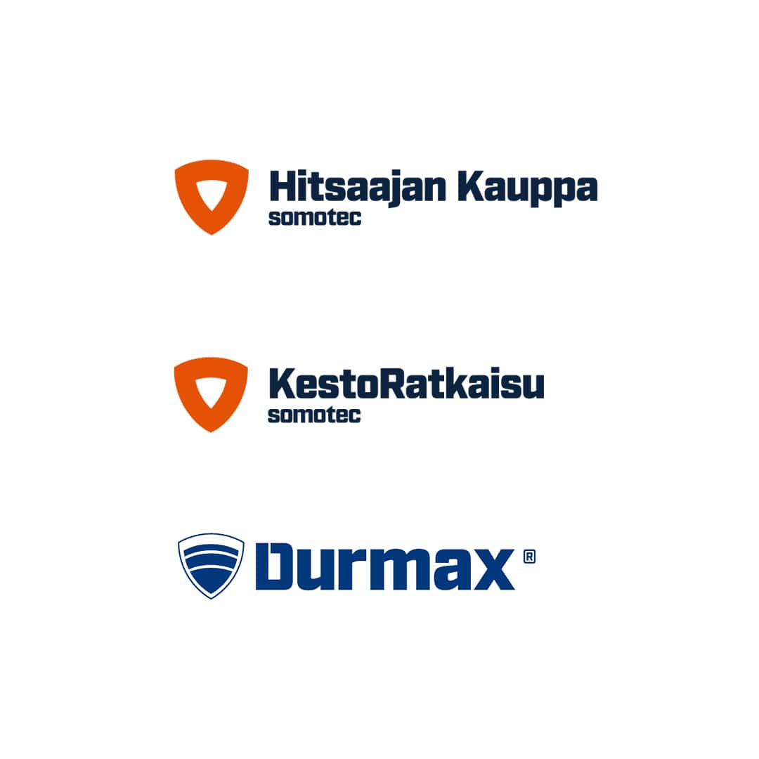
In working with Somotec, we saw Somotec’s expertise and years of experience as a positive thing. We just needed to shine a light – in Somotec’s case, the light from a welder’s torch – on the beauty of their work and its inherent toughness. Updating their identity brought out their authenticity. We created a shield and used parts of the shield to form an “S” logomark. Now their toughness, and the protection they bring to their customers’ products, is instantly recognisable.
The welder’s torch also inspired our motion graphics animations, which added a modern touch to the brand’s image. In the end, Ahooy helped Somotec do what it does for its customers – we built a protective shield for their brand that fights against the natural forces that occur over time.
A brand built to last
“Ahooy is a solid anchor in our team! We appreciate their approach to work, and how they dove deep into our corporate identity and business. They tackle new things with genuine interest and passion, making the customer feel important and serving as a far-reaching, strategic marketing partner. The work is of high quality, and they stick to deadlines. They are a great partner to work with.”
– Ellinoora Riihiluoma, Customer Service Manager, Somotec


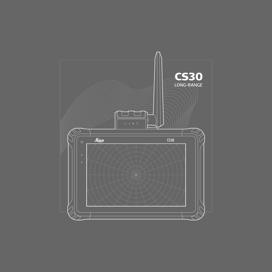
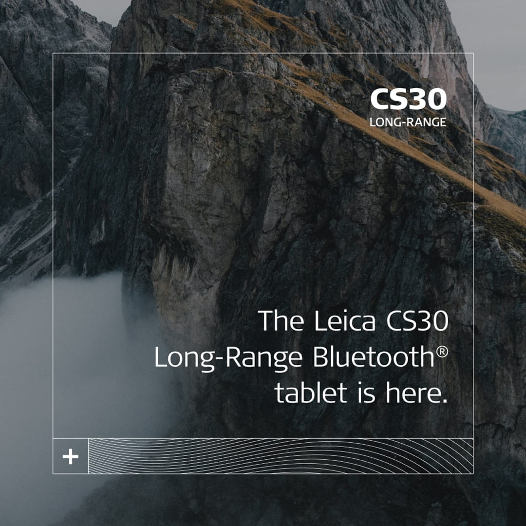
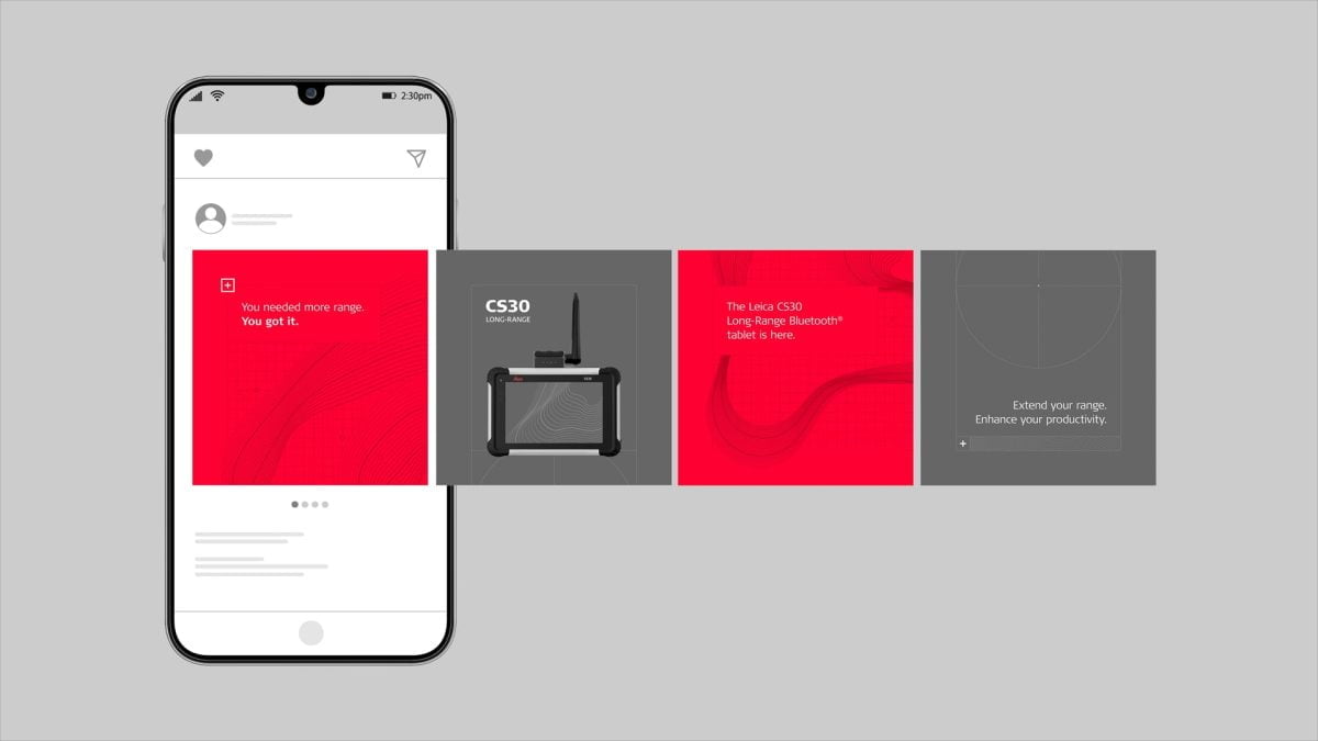
Extend your range
The Leica Geosystems CS30 Long-Range Bluetooth® tablet is an updated version of the trusty Leica CS30. Launching a long-range version of this tried-and-true product communicates Leica Geosystems’ understanding of its customers’ needs. The campaign is specifically tailored for surveyors and business owners.
The result was a visually impactful and succinct campaign that was published across Leica Geosystems’ various social media channels. The campaign, lasting for months, consisted of several social media posts, including two animations, and an image for the landing page on Leica Geosystems’ website.