250th Anniversary logo | The city of Kuopio

Our city – 250 years young
Kuopio celebrates its birthday in 2025. In honour of the celebration, the city’s vibrant brand received a cheerful addition: the 250th-anniversary campaign logo.
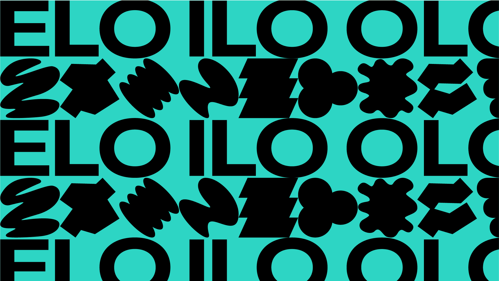
The logo embodies the idea of a joyful Kuopio. Ilo translates to joy in english and is one of the key pillars of the city brand. It’s the fun and rewarding side of life. Joy is found in our communities which are filled with friendly people who want to make the most of life, and who genuinely want to help you make the most of yours. It lives in new experiences, in our bustling-yet-peaceful city, in our old-growth forests, in the citys history and on the beautiful shores of our many, many pristine lakes. Here, joy is born from trust, curiosity and our welcoming people. There is even a bit of luck or magic to it. It can be discovered wherever you look and in something as simple as a kind smile from someone you pass on the street. The campaign identity is a reflection of this and consists of various shapes that stand out as independent elements, yet together they form a greater whole.