
A brand that mirrors the rich tapestry of life in Lieksa
Lieksa is a unique border town in Finland whose vitality springs from the surrounding nature. Its neighbourhoods, attractions, and local culture are shaped by its exceptional frontier location and natural surroundings.
At the turn of 2020, we were selected to work on the renewal of Lieksa’s brand strategy and identity. Five years later, the visual identity and messaging are still going strong, proving that good design stands the test of time.
The richly nordic design of the elements draw inspiration from the forests and lakes surrounding Lieksa, as well as the region’s enduring folklore and rich history. The visual world aims to weave a connection between the past and present, translating folklore’s essence into a design language that feels both timeless and contemporary. It strives to captivate with its depth, charm with its warmth, and inspire with its layered storytelling.”
This approach positions the visuals as both a tribute to tradition and a dynamic canvas for modern interpretation.
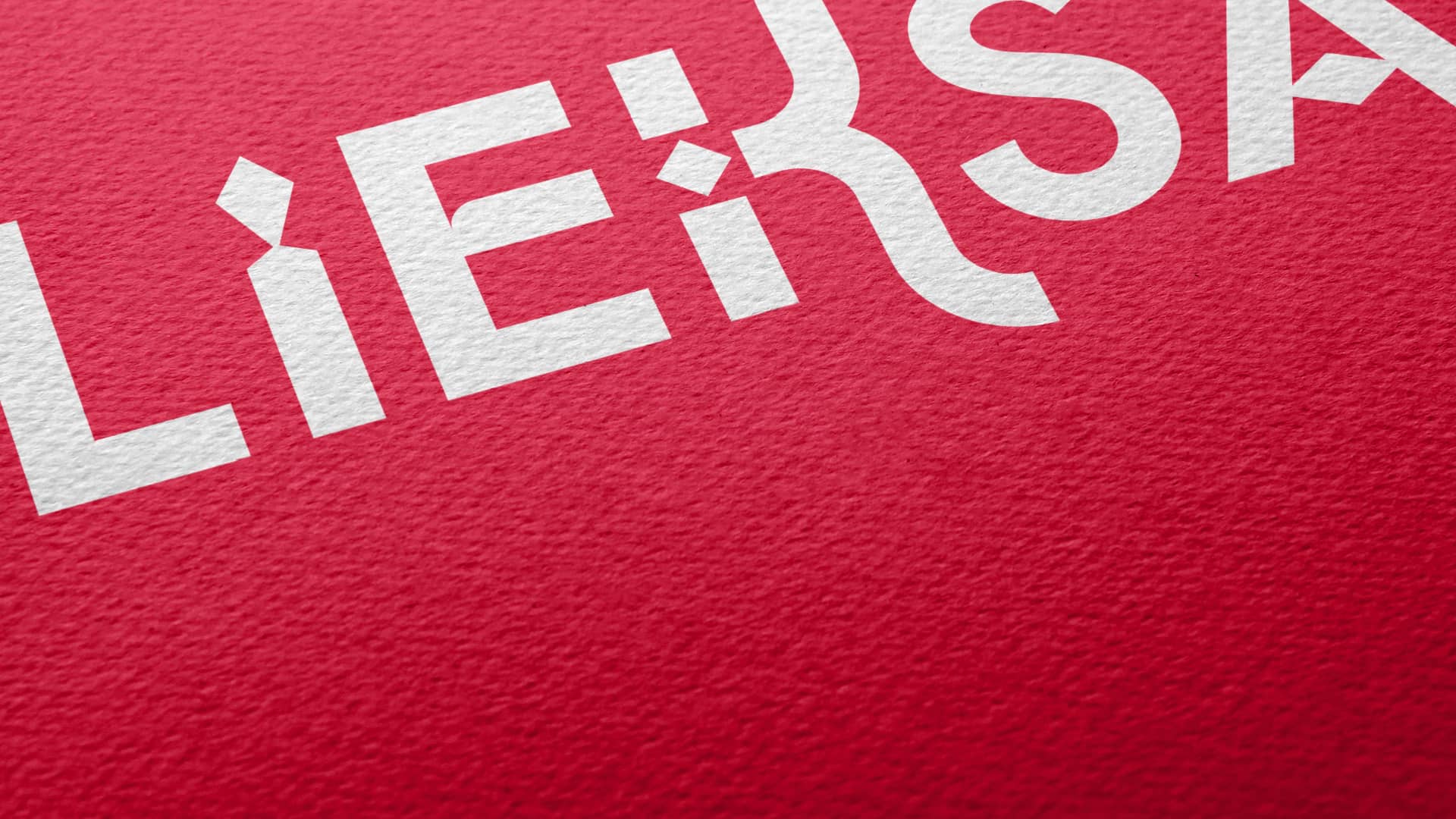
The fresh and modern logo conveys energy, warmth, and a zest for life. Its iconic and clear color palette, combined with a distinctive design language, enhances recognition and directs thoughts toward the city of Lieksa and North Karelia. With its intriguing and bold expression, the emblem functions excellently as a standalone element, even on large-scale surfaces such as signs and illuminated advertisements.


Lieksa’s visual world is natural, authentic, and clear, weaving a rich narrative that reflects North Karelian and Finnish identity. With a fresh, modern twist on rustic romanticism, it captures themes of people, nature, and urban life, enhanced by textures drawn from both natural and built environments.
The unique graphics, inspired by North Karelian ornamentation, add personality and playfulness to the brand’s identity. These elements seamlessly blend tradition and modernity, creating a visual language that is both versatile and captivating. Whether combined into intricate patterns or used as standalone features, they evoke a sense of timeless storytelling while remaining fresh and contemporary.

The slogan beautifully captures the essence of the Lieksa spirit, so much so that it can be said this process successfully distilled what Lieksa and its identity truly embody at their best.
Lieksa – Where there is wilderness, there is gold.
– Heli Turpeinen
Communications Secretary, City of Lieksa


The collaboration with Ahooy Creative was smooth and full of ideas. The city’s value proposition, shaped during the process—that Lieksa is a city where it is good to grow and where growth thrives—provided a solid foundation for this transformation.
The resulting visual identity, now approaching five years in use, remains fresh and in tune with the times. The logo, inspired by the bow in the city’s coat of arms, is distinctive, clear, and easy to read. The project also included updating the visual identities of the city’s subsidiary companies, creating designs that are unique yet clearly part of the Lieksa family—a result that continues to work well.
In addition to the visual identity, the city launched a slogan that residents embraced from the very beginning. The slogan vividly captures the spirit of Lieksa, so much so that it can be said that this process successfully distilled what Lieksa and its identity represent at their very best:
Lieksa – Where there is wilderness, there is gold.
– Heli Turpeinen
Communications Secretary, City of Lieksa


Our city – 250 years young
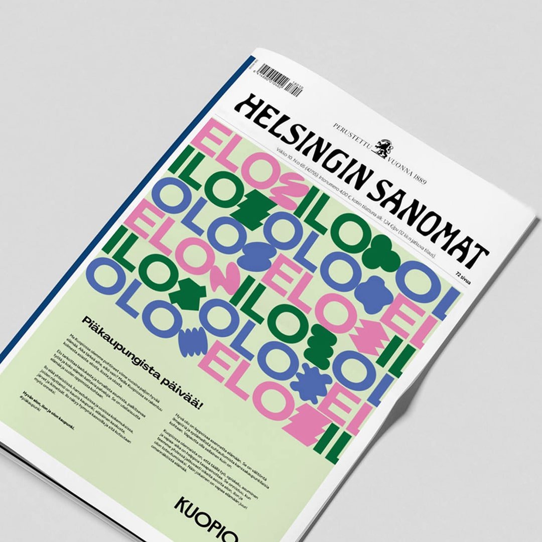
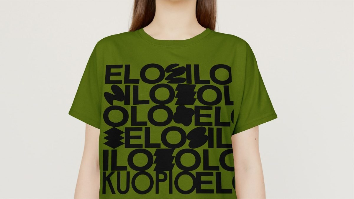
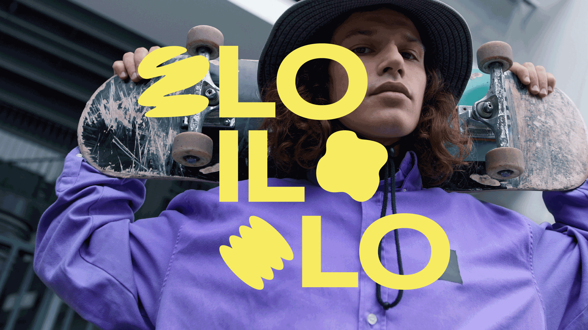
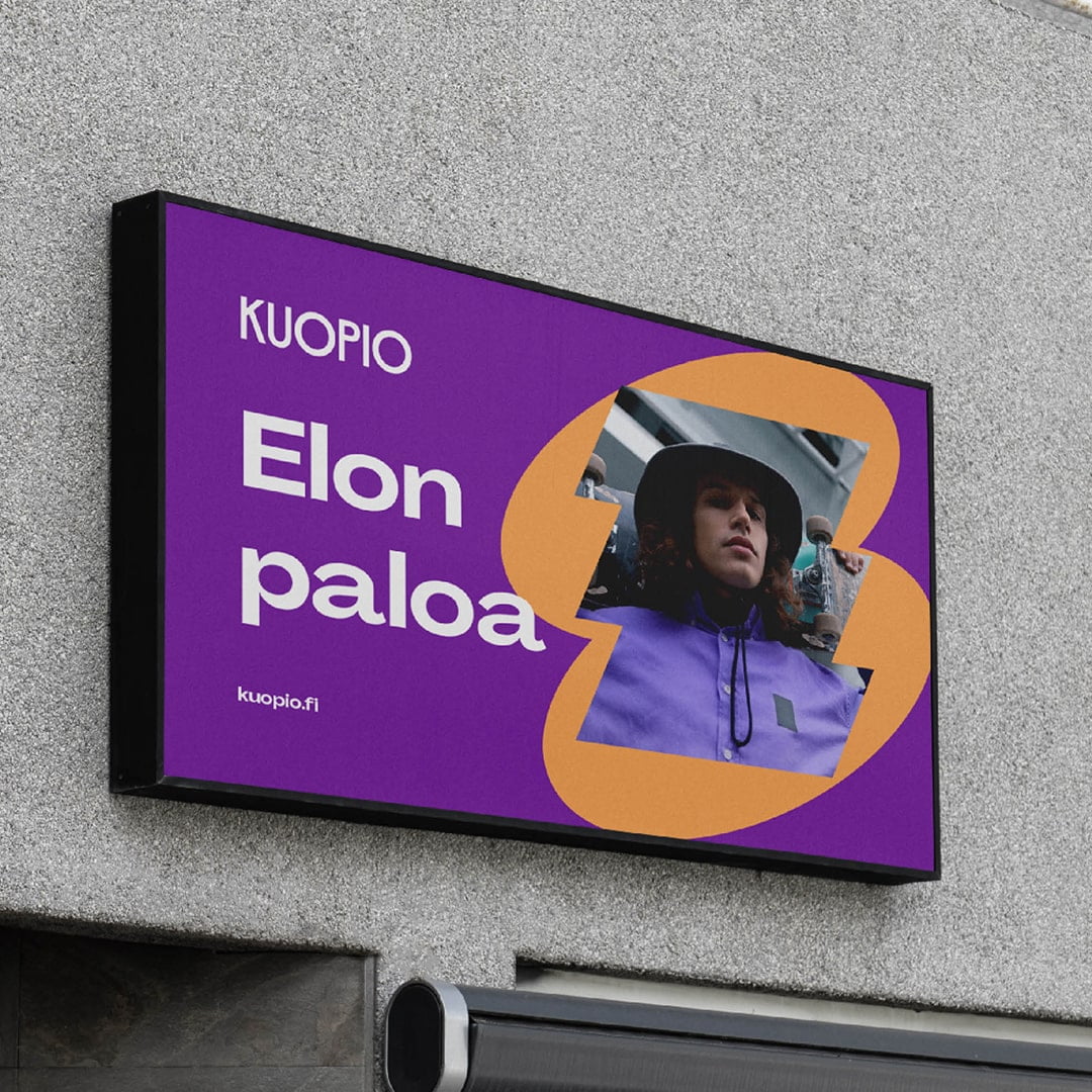
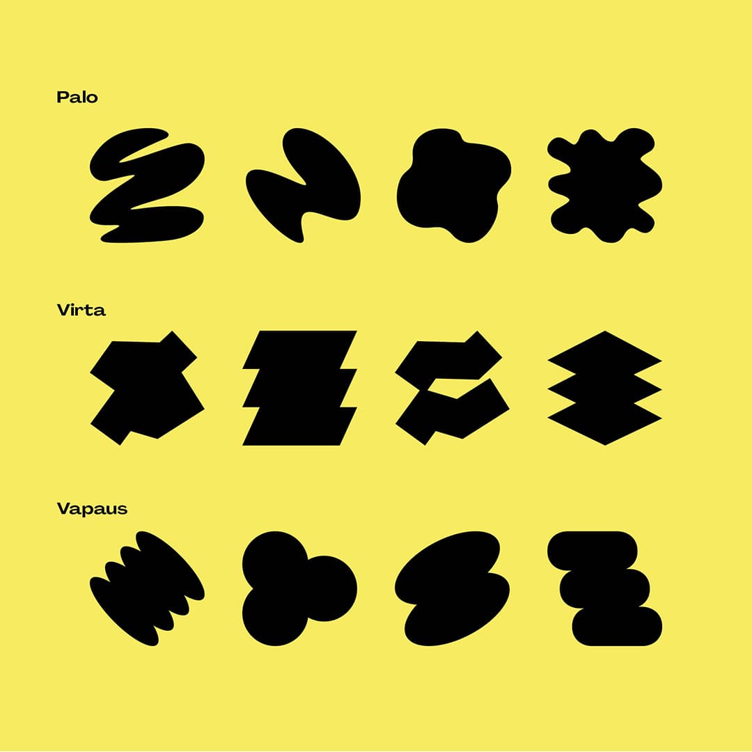
Kuopio celebrates its birthday in 2025. In honour of the celebration, the city’s vibrant brand received a cheerful addition: the 250th-anniversary campaign logo.
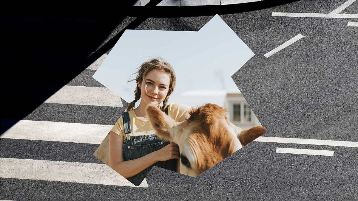
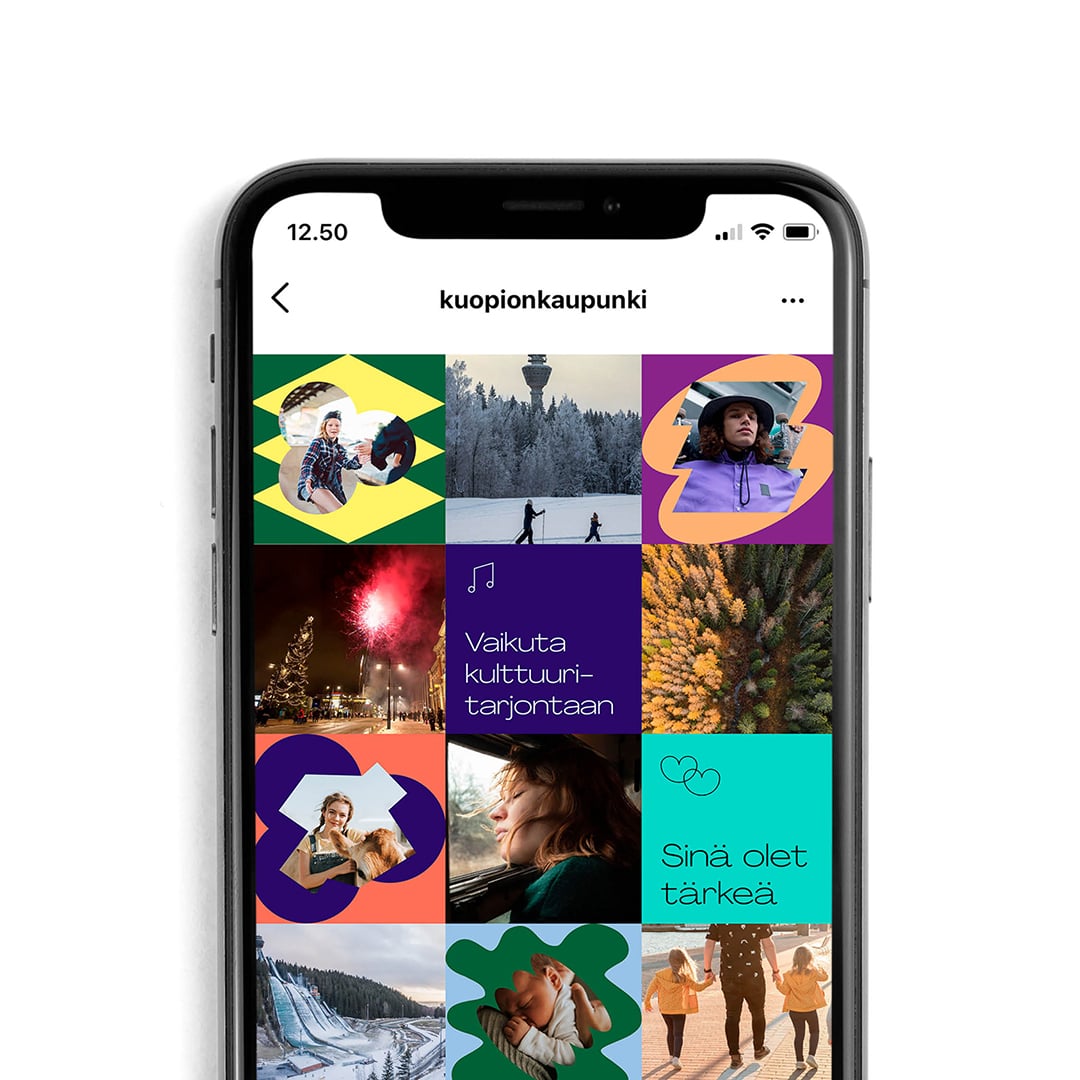
The logo embodies the idea of a joyful Kuopio. Ilo translates to joy in english and is one of the key pillars of the city brand. It’s the fun and rewarding side of life. Joy is found in our communities which are filled with friendly people who want to make the most of life, and who genuinely want to help you make the most of yours. It lives in new experiences, in our bustling-yet-peaceful city, in our old-growth forests, in the citys history and on the beautiful shores of our many, many pristine lakes. Here, joy is born from trust, curiosity and our welcoming people. There is even a bit of luck or magic to it. It can be discovered wherever you look and in something as simple as a kind smile from someone you pass on the street. The campaign identity is a reflection of this and consists of various shapes that stand out as independent elements, yet together they form a greater whole.


City of Kuopio – a city of life, joy and well-being
Cities around the world are experiencing rapid development and their brands have to follow suit, including those in Finland. The reason is clear. Businesses compete for customers and cities need to attract residents, businesses, and tourists to stay relevant. Kuopio has risen to second place on Finland’s most attractive cities list, and it was essential that its beauty and character was reflected in its brand.
At the heart of our work was a desire to shine a light on Kuopio’s uniqueness. The city’s renewed promise, key messages, and visual identity now better reflect Kuopio’s diverse community of residents, businesses, and other stakeholders. The brand identity is more recognisable across different mediums and easier to integrate into different environments. Best of all, because the brand refresh feels as authentic and alive as Kuopio itself, it gave city residents an opportunity to feel a greater sense of belonging and pride in their hometown. That’s the power of branding and design at work.
Explore the City of Kuopio brand portal (in Finnish):
https://kuopionkaupunki.brandiportaali.fi/

The capital of the good life
“It is an honour for us to develop and nurture the Kuopio brand, which is owned by all of Kuopio’s residents. The brand had to be true to the people of Kuopio and desirable to others. We needed a partner who shares the same values and understands the significance of the Kuopio brand. A symbiotic working relationship and an understanding of the city’s strategy and evolution of the brand were prerequisites for successful work. I am grateful for the journey and satisfied with the outcome.”
– Kirsi Soininen, City of Kuopio Marketing Director


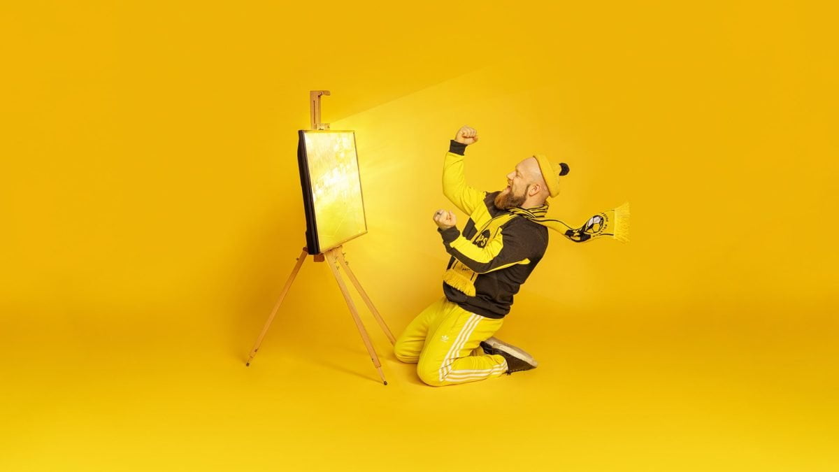
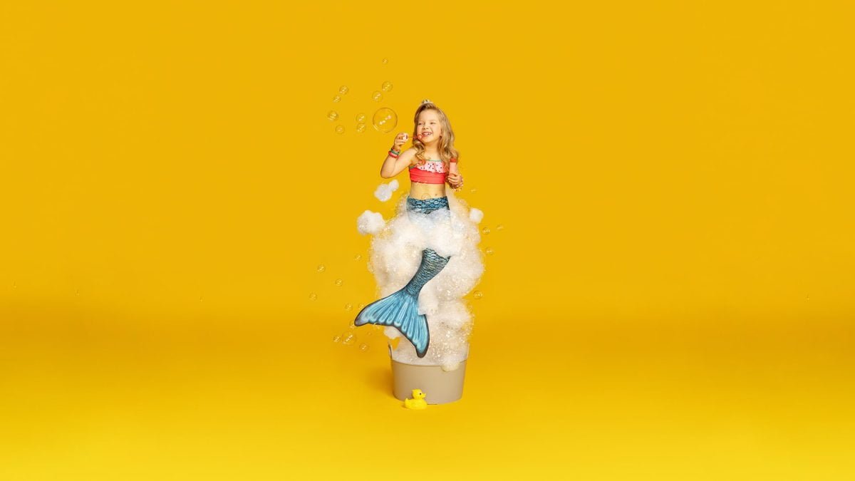
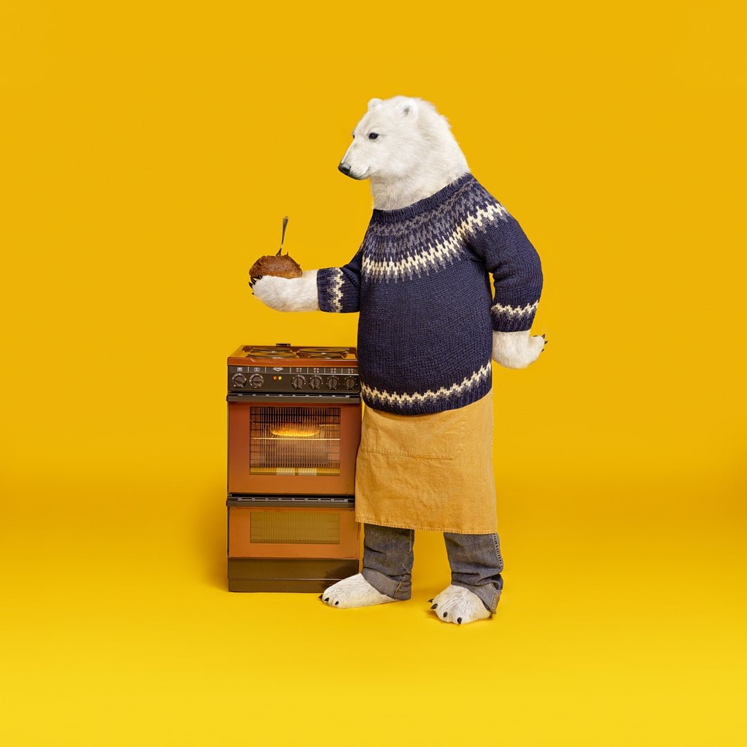
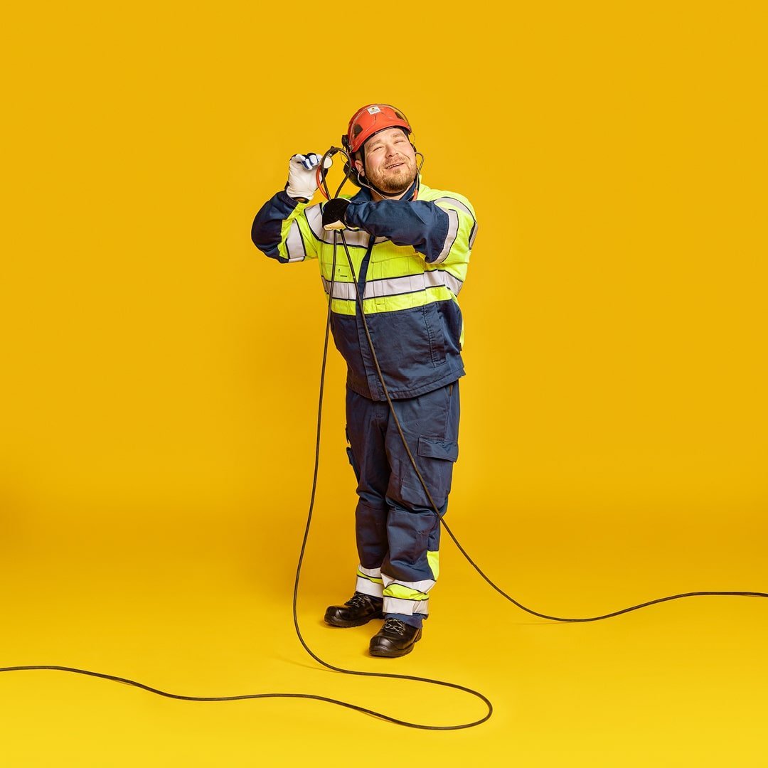
Good energy is contagious
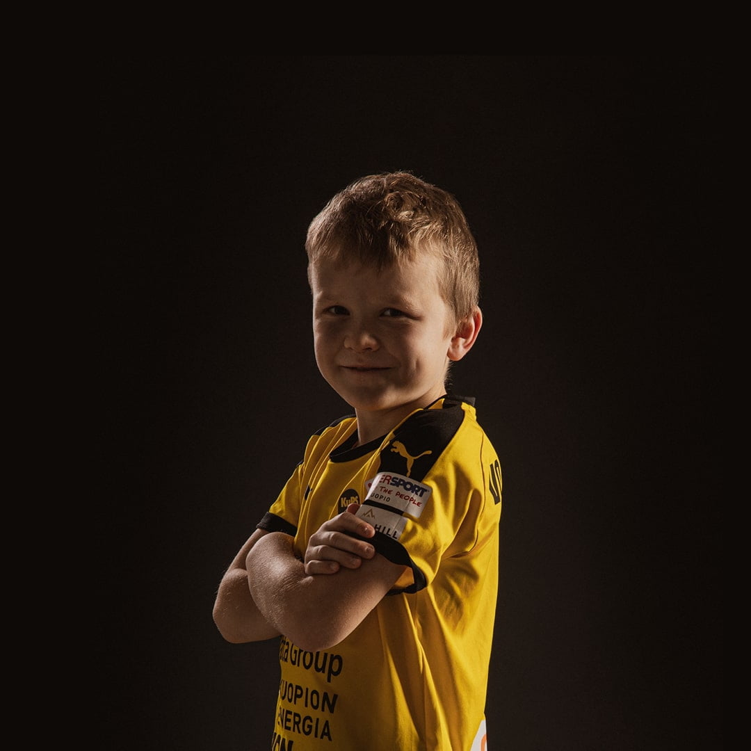
Kuopion Energia already had a strong position in the market, but their image didn’t align with how their long-term customers perceived them. While helping our client rethink their perspective of their products and services, we realised the importance of reminding their target audience that, as a local energy provider, the company is an essential part of the community. That’s why we developed an approachable and relatable brand image that better reflected their important work and their place in the community – the way any good neighbour would.
Check out the music video we created for Kuopion Energia:
Kuopion Energia – Sen tuntee
Warmth of life
“The process went incredibly smoothly. It was almost surprising how well the initial drafts of the brand strategy resonated with the entire management team. The development of the strategy was highly systematic, and we stayed perfectly on schedule.”
– Satu Nurminen, Head of HR and Communications, Kuopion Energia

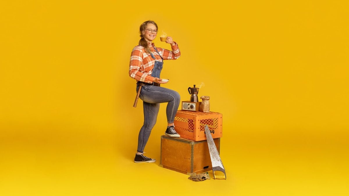
Photography: Petra Tiihonen
Video: Nobrainer Films


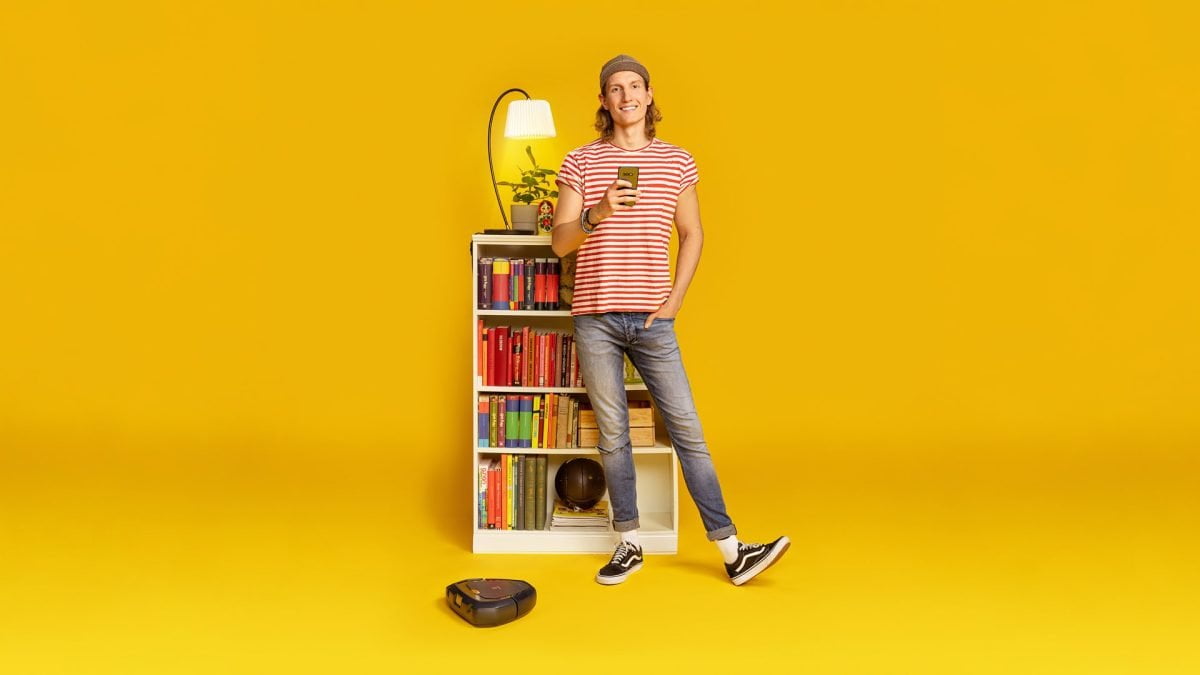
Brand Photos: Akseli Muraja


Photography: Riia Grasshill


Video and Photography: Markus Aspegren, Lasse Hartikainen